Author: Anna Perronnet

  • Week 6 : lots of research

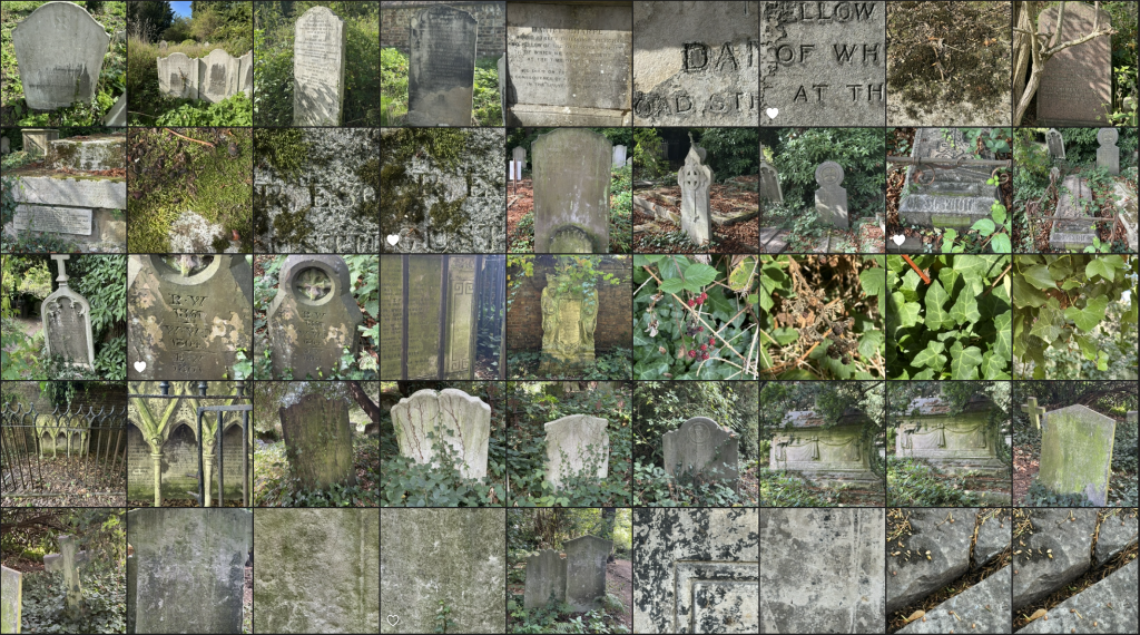
    Tapestries woven in the Middle Ages were mainly intended to decorate civil residences and religious buildings.

    Initially inspired by religion to educate the people, medieval tapestries became more prestigious towards the end of the 14th century, depicting stories illustrating the life of their owner. They were arranged in sets. The Bayeux Tapestry and The Lady and the Unicorn are masterpieces of this period.

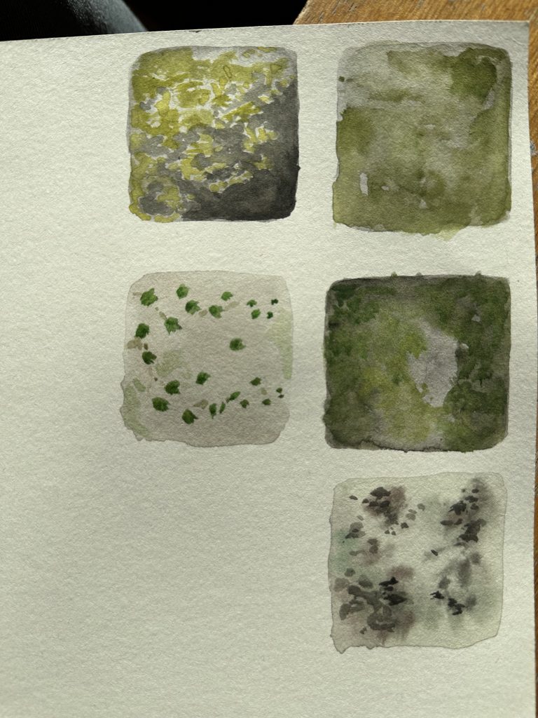
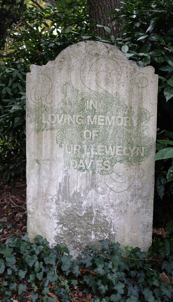
    The tapestries accurately reflect the social and political aspects of society in past times. They are images full of mystery that freeze time.

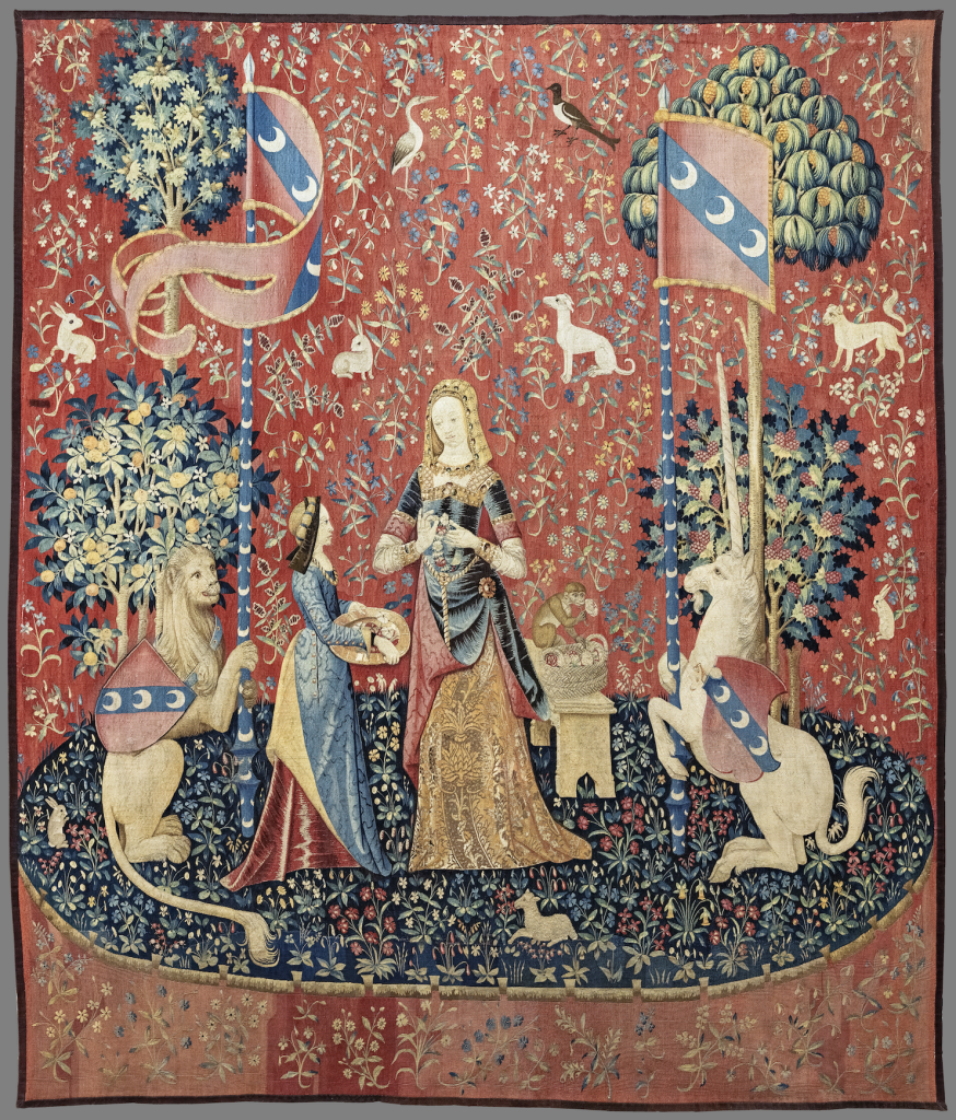
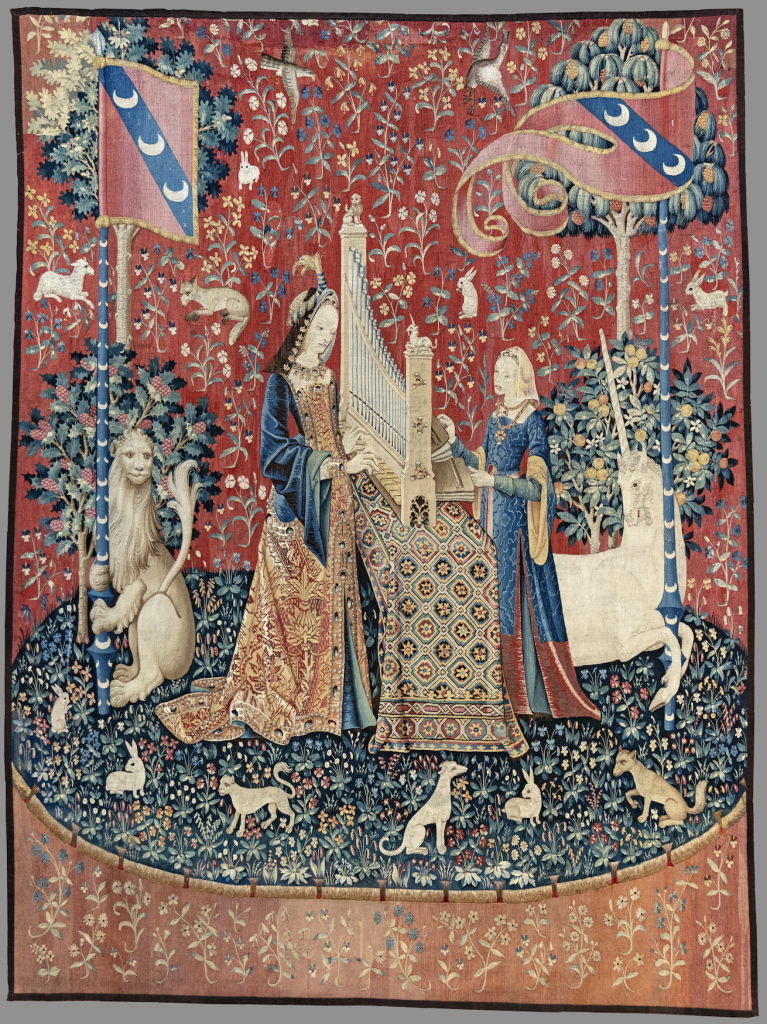
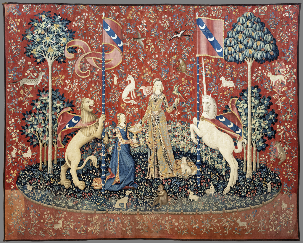
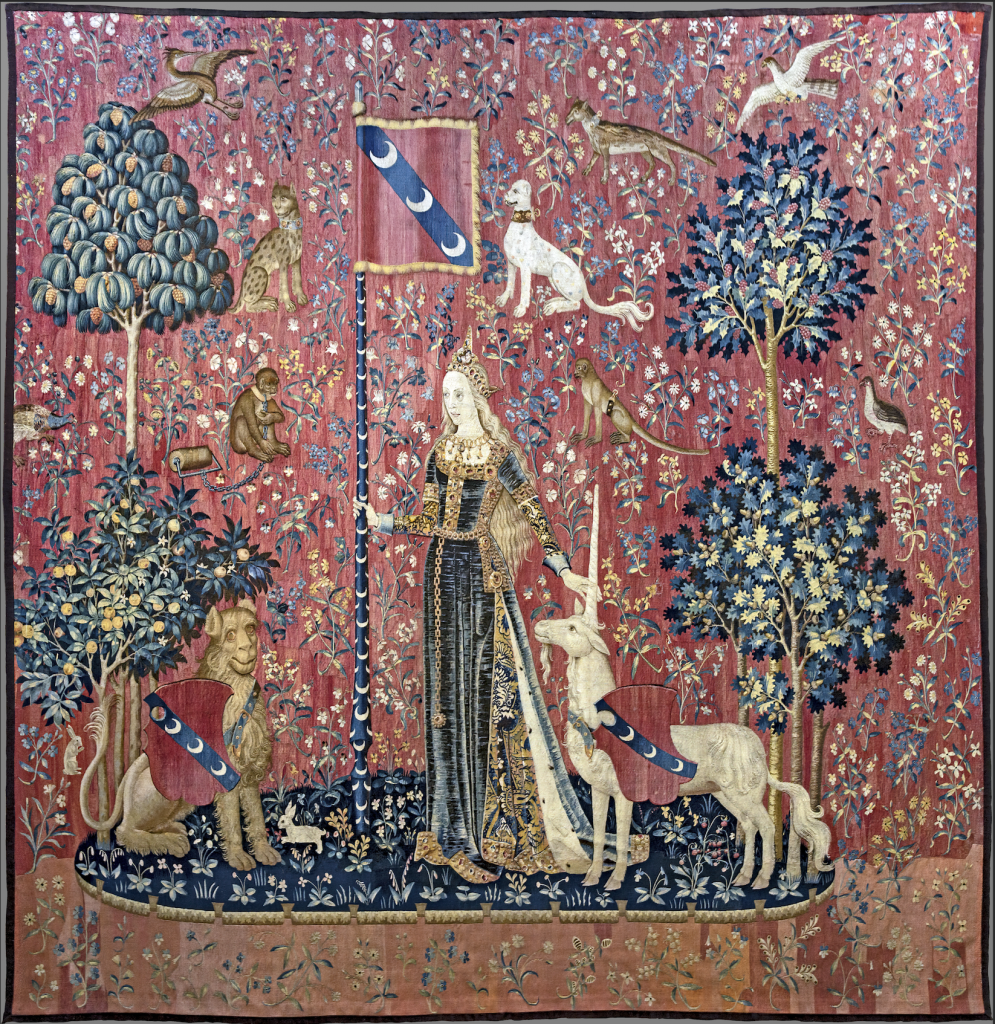
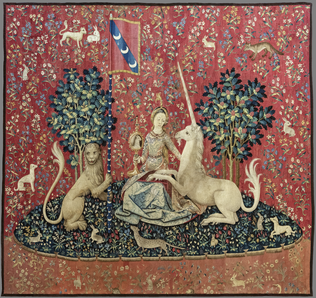
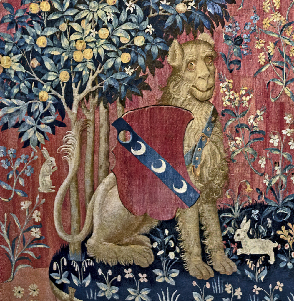
    The tapestry known as The Lady and the Unicorn is a series of six tapestries from the early 16th century. A masterpiece from the early French Renaissance, it is kept at the National Museum of the Middle Ages-Thermes and Hôtel de Cluny in Paris.

    Five of these representations form an allegory of the five senses, symbolised by the lady’s occupation :

    • Sight: the unicorn gazes at itself in a mirror held by the lady;
    • Smell: while the lady is making a crown of flowers, a monkey sniffs the scent of a flower it has picked.
    • Hearing: the lady plays a small organ.
    • Taste: the lady takes what could be a sugared almond from a cup held out to her by her servant and offers it to a bird.
    • Touch: the lady holds the unicorn’s horn in her hand, as well as the pole of a standard.

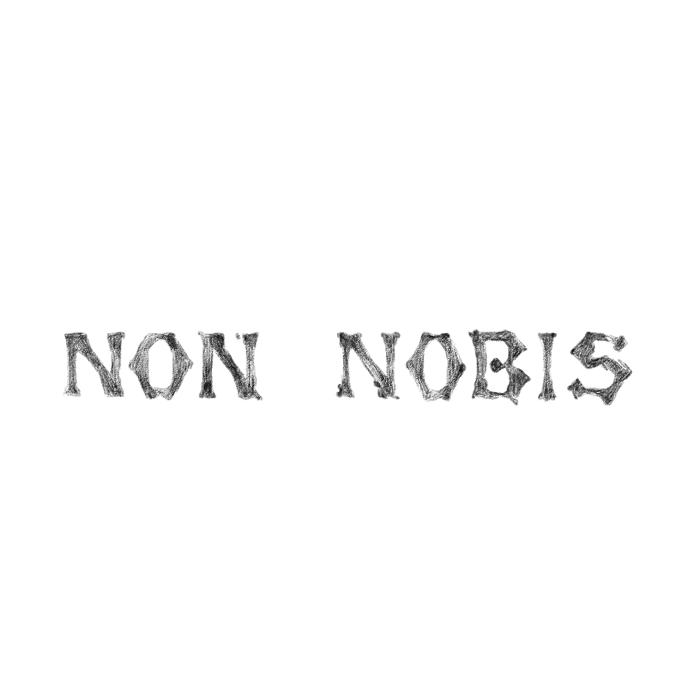
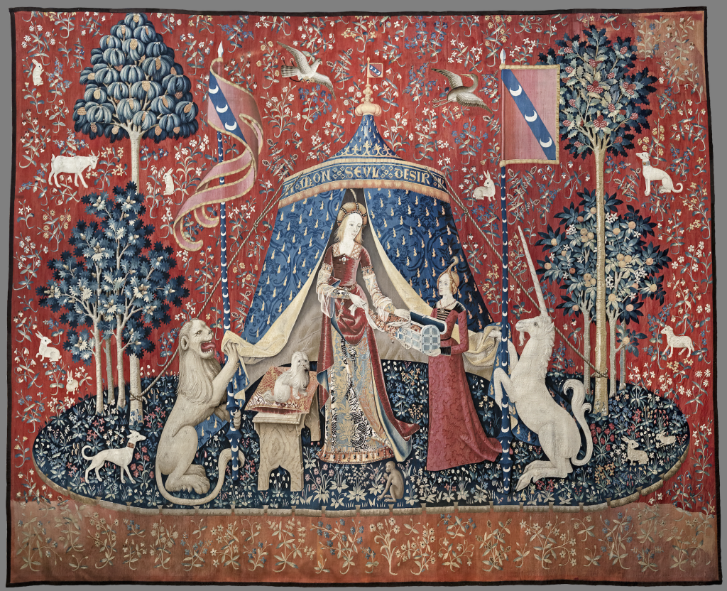
    The sixth tapestry, representing the sixth sense, can only be interpreted by deduction from the hypothesis of the five senses. Framed by the initials A and V or I, the motto ‘My only desire’ can be seen at the top of the blue tent.

    1. Translation of the language of heraldry

    My first method would be to translate literally what is represented on the tapestries using the iconology of old images where every tree, animal, object has a meaning, and the understanding of the coat of arms, their colours and symbols.

    2. My One Desire

    The sixth tapestry is still a mystery for historians. The phrase written on the tent can have different meanings in French. It can be translated as ‘My One Desire’ but also as ‘According to my will only’.

    Anagrams of the motto can also be found :

    DON LE URAI SEMS : Donne le vrai sens Give true meaning
    SENS AMOR DEUIL : Sans amour deuil Without love, mourning
    LE UI SENS D AMOR : Le VIème sens d’amour The sixth sense of love

    The tapestry raises many questions :

    • Could the sixth sense be the heart that governs all the other senses, as the theologian Jean Gerson wrote at the end of the 14th century? (The writings of the Chancellor of the University of Paris, Jean Gerson  (1363 -1429) mention ‘six senses – five external and one internal – namely the heart – which we must master as six schoolchildren.’ He sees the heart as the controller of the physical senses and needing to be schooled to avoid sins such as lust.)
    • Or, to quote a commentary from Plato’s Symposium, could it be the understanding, intelligence and beauty of the soul?
    • Is the Lady renouncing pleasure by placing the necklace in the chest?
    • Is the focus on the importance of moderation in all things, allowing one to enjoy sensual pleasures without becoming enslaved to them?

    3. The Lady

     The lady in the tapestry, with her lily-white complexion, ruby lips and golden hair, is a beauty whose praises have been sung in courtly literature since the 12th century. She is not a portrait of a woman who lived in the Le Viste household, but the embodiment of the ideal woman according to medieval standards.

    She isn’t the subject of the piece, but only an allegory of the senses, so what of her thoughts, her point of view and her desires?

    Bourgeois, L. (1992) Garment from the performance “She Lost It…”. [Artwork].

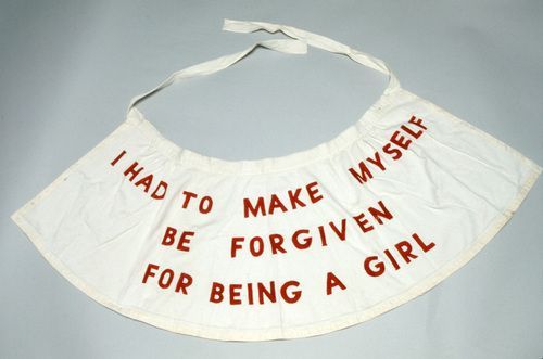
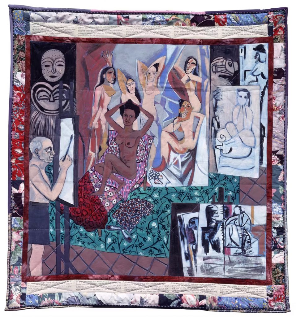
    Seeing this tapestry with a feminist point of view, made me think of Louise bourgeois’ work, as part of the ‘New Tapestry’ movement.

    The Jean Lurçat Museum of Contemporary Tapestry, in its exhibition ‘Tapestry? From Picasso to Messager’, examines the place and importance of this textile art, as well as its status in contemporary art. For female artists such as Louise Bourgeois, textiles have become a symbol of protest against their status in Western society.

    Bourgeois, L. (2009) Self Portrait. [Artwork].

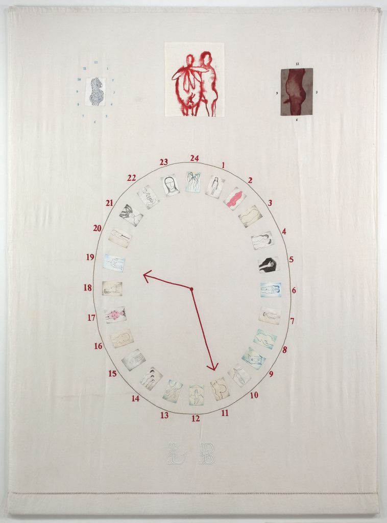
    In this artwork, she explores life as a girl, woman, wife, mother, and artist, through her physical and emotional transformation as the hours advance.

    4. The unicorn

    Reuwich, E. (1486) Animals of the Holy Land, in Breydenbach, B. von. Peregrinatio in terram sanctam. Mainz: Erhard Reuwich.

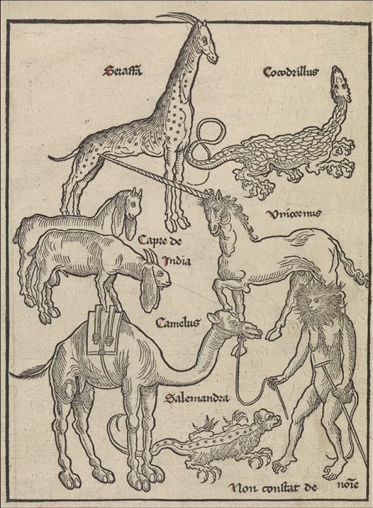
    Unicorns were believed to be real animals in Medieval times. Some were supposedly spotted in Mount Sinai. Another print locates their native habitat in the Americas. Eminent scholars and explorers reported seeing this wild animal during their expeditions to distant lands, particularly India. However, it seems that the animal observed by the explorers was in fact the Javan rhinoceros, which has a horn on its skull.

    It was in the 12th century that unicorns became a symbol of purity. They were associated with the Passion of Christ and his sign of chastity. Its horn was believed to be an antidote to poison and could purify contaminated water.

    The belief was that only a virgin could tame a unicorn, with its reference to sexual innocence and experience

    The portrait of the creature is fierce, tender, and pure. He embodies matters of faith, as well as the heart. In wedding portraits, he represents the taming of the beloved.

  • Written response 2.0

    Michel Foucault’s Preface to The Order of Things : An Archaeology of the Human Sciences can be read as a catalogue in itself — a text that inventories systems of thought, names, and classifications (Foucault, 1989, pp. xvi–xxvi). Often described as a manifesto of structuralism, it stands against a certain form of humanism by dismantling the idea of a stable human subject and instead proposing the concept of the épistemè, the underlying structure that shapes what a culture considers knowledge at a given time (Foucault, 1989, pp. xvi–xxvi).

    In this sense, the Preface functions both as an introduction and as an inventory itself : Foucault lists his predecessors, maps intellectual lineages, and enumerates the methodological orders that have governed Western knowledge. His text mimics the very mechanisms he analyses. It is rhythmically built from sequences of repetition and accumulation :

    394 commas

    44 semicolons

    41 identifiable lists 

    5 repetitions

    punctuate the pages. 

    Terms such as 

    56 order

    8 classification

    6 enumeration

    6 system

    2 list

    recur like motifs, forming a linguistic taxonomy that mirrors his argument, as if self-referencing the structure of the text.

    The repetition of 

    9 Borges

    4 Chinese encyclopedia

    13 other names Roussel, Keynes, Cantillon, Tournefort, Linnaeus, Buffon, Cuvier, Darwin, Bauzée, Law, Véron de Fortbonnais, Turgot

    underscores the significance of his peers in his demonstration. The ‘Chinese encyclopedia’ whose absurd categories destabilise the reader’s sense of logic. This anecdote becomes Foucault’s demonstration of how every system of order is culturally specific, and how each period invents its own grid of intelligibility.

    By analysing the Preface through an inventory, its writing mechanics are revealed as inseparable from its philosophical argument. Each list, each comma, each repetition is not decorative but conceptual. They build a textual space that mirrors Foucault’s archaeology. The Preface is therefore a structural performance, a ‘list of lists’ where the medium embodies the message. Through the enumeration of names, systems, and methods, Foucault shows that to catalogue is already a constructed worldview.

    Reference :

    • Foucault, M. (1989) ‘Preface’, in The Order of Things: An Archaeology of the Human Sciences. London: Routledge. [1966], pp. xvi–xxvi.

  • Weeks 4 & 5

    For this brief I decided to go with the harvard digital collection
    Artemas Ward House and Its Collection which was the House of the first commander-in-chief of the Patriot forces and is nowadays a museum. It was built in the 1720-1730s by his father Nahum Ward and was extended in 1785 and 1830 to accommodate the big family, the farm hands and domestic help.

    The collection includes everyday objects such as clothing, furniture and household items belonging to members of the family.

    The first thing I looked up about Artemas Ward was his family : he had 6 brothers and sisters and had 8 children with his wife.

    My first experimentation was to catalogue the objects as a family tree, by personifying the objects. Deending on who they belonged to, how they look and what they are used to, I entanded to transform all the objects in as part of a big and intricate family tree.

    But because the feedback, I went back to the inquiry, by analysing more in depth the collection itself. Imagine the life they lived from the objects, look more intimately into it, how to reconfigure the set to give it another meaning and purpose.

    After looking at the materials (wood, metal, textiles, porcelain, beads, leather), the occupations and activities these objects are used for, and the gender and age of family members, I decided to focus on the importance of women in the household.

    The house is named after Artemas Ward even if the traces of his existence in the house are rare.

    Women of the house, as caretakers, recorded stories of the family and the neighbourhood which were published in the book Old Times in Shrewsbury Massachusetts, Gleanings from History and Traditions.

    Hardman Quilt, 1885. 
    Made by Mrs. Edwin Hardman.

    Quilt was common in the late 17th century. It was a decorative display of needle work but also a medium of story telling, solidarity and social change. Some of the intricate design could tell stories.

    Ringgold, F. (1991) Picasso’s Studio, The French Collection Part I, #7. Acrylic on canvas with printed and painted fabric border. Courtesy ACA Galleries, New York.

    ‘With The French Collection, I wanted to show that there were Black people in the era of Picasso, Monet and Matisse, to show that African art and Black people had their place in this history.’

    Ringgold, F.

    Patchwork can be used to tell different stories and narratives.

    Looking at the floor plan, I thought it looked a lot like a quilt pattern. So I used it to create my own quilt and tell a story through it.

    The objects in the collection that I redrew with lines to give them a stitched look are placed on the plan to show the importance of women in the house. They are located in the rooms according to the activities they are dedicated to or who they belonged to. 

  • Written response

    In Lines: A Brief History, Tim Ingold explores the fundamental relationship between drawing and writing. He states that ‘The engraver was an artisan, not an artist ; his lines were not expressive but reproductive.’ (Ingold, 2007, p. 135) and discusses how artisans who engraved letters and inscriptions were historically considered craftsmen rather than artists. 

    This idea directly resonates with my project, where I focus on tombstones. The theme I wanted to bring up in my project is how engraved texts carry meaning. When I observed the engraved names and dates on tombstones, I was struck by how these inscriptions, that hold immense emotional and symbolic weight end up disappearing. They are not written for the dead but for the living. Inspired by this, I decided to highlight and reinterpret these marks.

    I began to draw the letters rather than simply write them, allowing them to dissolve and merge into my drawings of plants. In doing so, I blurred the boundary between text and image. While the technique of engraving immobilises the letters, I chose, buy drawing them, to make them lively again. Rosemary Sassoon’s assertion that ‘the form and line of a letter is as sensitive and expressive as the line quality in a drawing’ (Sassoon, cited in Ingold, 2007, p. 179) further reinforces my approach. In my work, writing becomes drawing.

    As the stone, a symbol of permanence, begins to crumble and fade, I replaced it with the motif of plants that grow and continue to live. This shift from mineral to organic matter represents the transformation of memory, from something fixed and engraved to something living and evolving. The letters, once static, become part of a living landscape.

    In The Gleaners and I, Agnès Varda investigates in her own way the different aspects of gleaning, from an ancient practice to what it has become today. She brings up a memory from her childhood, she had already seen gleaners in the fields near the house where she lived, and that this image had made a lasting impression on her. She considers herself a gleaner of images and her approach on the subject is personal as she goes around with her camera.

    My approach on this project is similar as I went to a churchyard because of my initial interest around death, with my camera and discovered a whole other aspect of the place. Between the stones and the trees, I saw people. I ended up reading information about unknown families and people based on their names and chose to pay tribute to them through my photographs.

    References :

    – Ingold, T. (2007) Lines : A Brief History. London : Routledge, pp. 120–151.

    – Varda, A. (2000) The Gleaners and I [film]. Paris : Ciné Tamaris.

  • Week 3 : Concept

    Feedback said that the nature could take over the whole page. So I decided to play with transparency, and started experimenting with tracing paper.

    The layer of tracing paper functions as a veil, evoking the materiality of a tomb covering and producing a soft, ghostly texture. Meanwhile, nature expands across the image, gradually overtaking the composition. The typography is designed to merge effortlessly with the image, becoming part of its atmosphere rather than standing apart from it.

    I created a system in which the names are initially unreadable, only becoming legible when two sheets of tracing paper are carefully aligned on top of each other. It makes the viewer’s engagement intentional and tactile.

    I used the font ont from Wikipedia and turned it into an organic font with missing/disappearing parts.

    Printing each part separately, I drew the white parts by hand so it would be more organic.

  • Week 1 & 2 : Investigatinggg

    First visit of the churchyard : I took pictures of every thing, tombs, plants, details…

    The names carved into stone, meant to stand as eternal markers of human presence, are gradually eroding, but at the same time, nature is growing, spreading. This interplay between human intention and natural processes raises profound questions about memory, legacy, and the passage of time.

    I ended up focusing on the graves where the text had been completely erased. With the man-made engravings completely gone, I imagined how moss would replace them.

    I drew the disappearing words, transforming them into new, custom fonts, and painted the moss in watercolour. Through this process, I sought to give them a lasting presence, to immortalise elements that were otherwise fading from memory.

    Documentation of the site is minimal, and personal histories were even harder to trace. While archival materials may list names and dates, visual evidence is largely lacking. Photographs are titled ‘No Grave Photo’, evoking a strange, haunting feeling, leaving the viewer with a sense of loss. It is oddly ironic : it signals the presence of information while simultaneously denying it.

    I did several tests, with a watercolour effect giving a mossy texture, fine drawings teeming with life. I also played with typography but the vivid green consistently felt off.