Category: Unit 1

  • Written response 5.0

    Group project

    Sarah, Doreen, and I began this exploration with very different perspectives and levels of knowledge, shaped by our diverse backgrounds, countries, and education about sustainability. When we started working with data, we encountered countless models and visual systems, each claiming to represent reality. The variety, and sometimes contradiction within these representations made us question their objectivity, so we chose to critically examine how maps constructed and communicated.

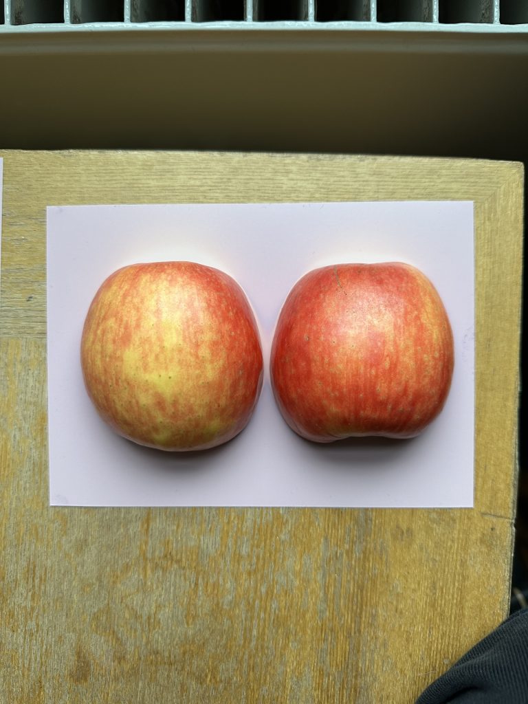
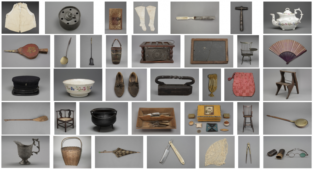
    Our conversations gradually shifted toward textiles and threads, a shared interest that felt both intuitive and meaningful. Textiles are closely tied to global systems of production, waste, and labor, making them an interesting lens through which to reflect on sustainability. They are also widely used by UAL students across disciplines and for diverse purposes, which made the material context feel relevant to our own environment. 

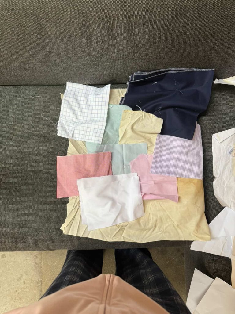
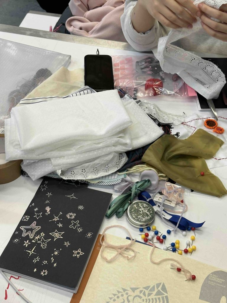
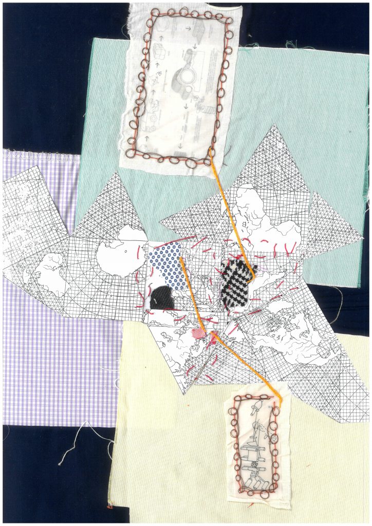
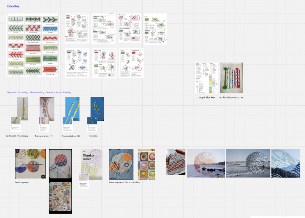
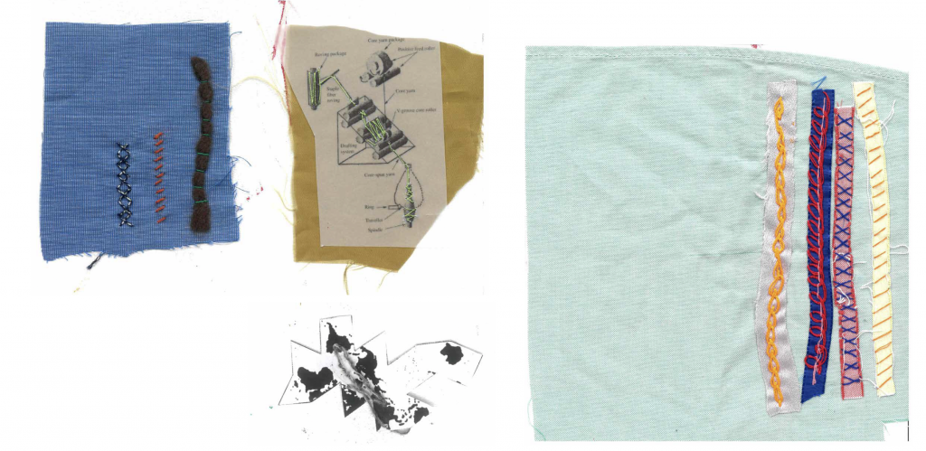
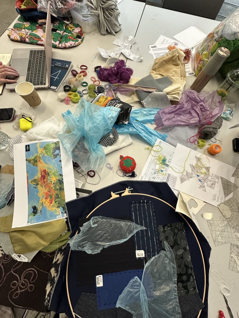
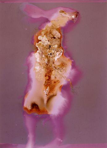
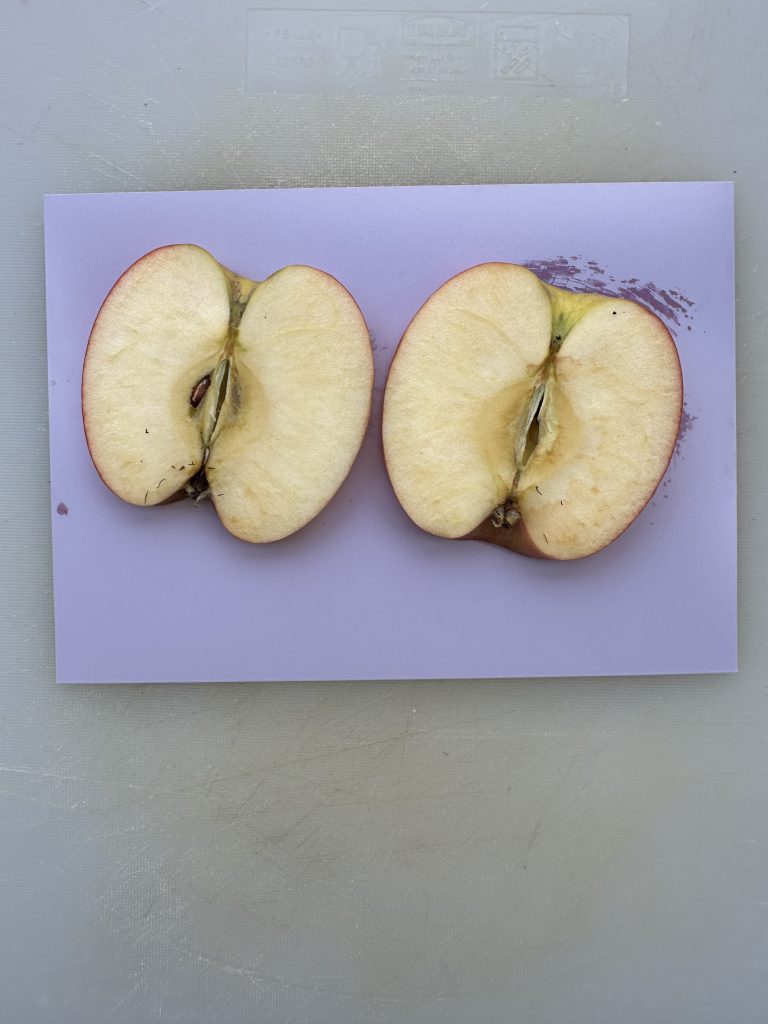
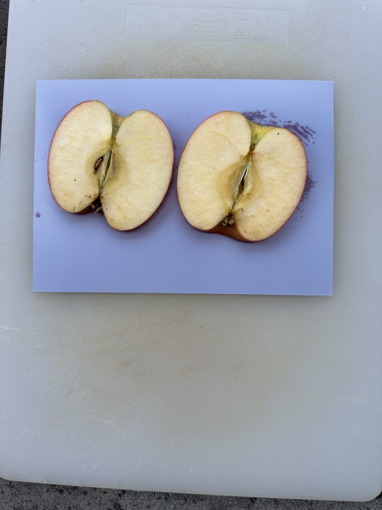
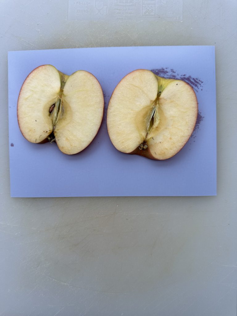
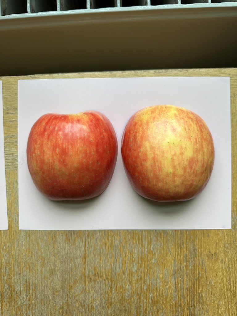
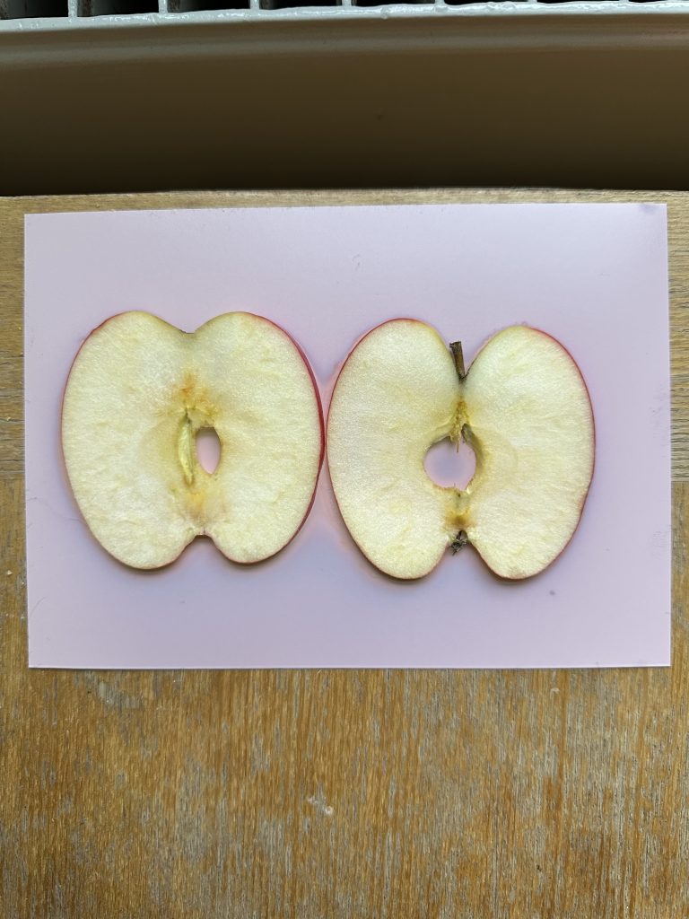
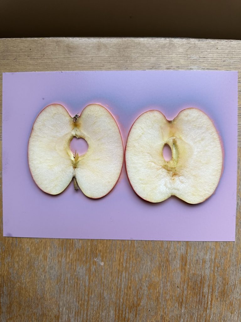
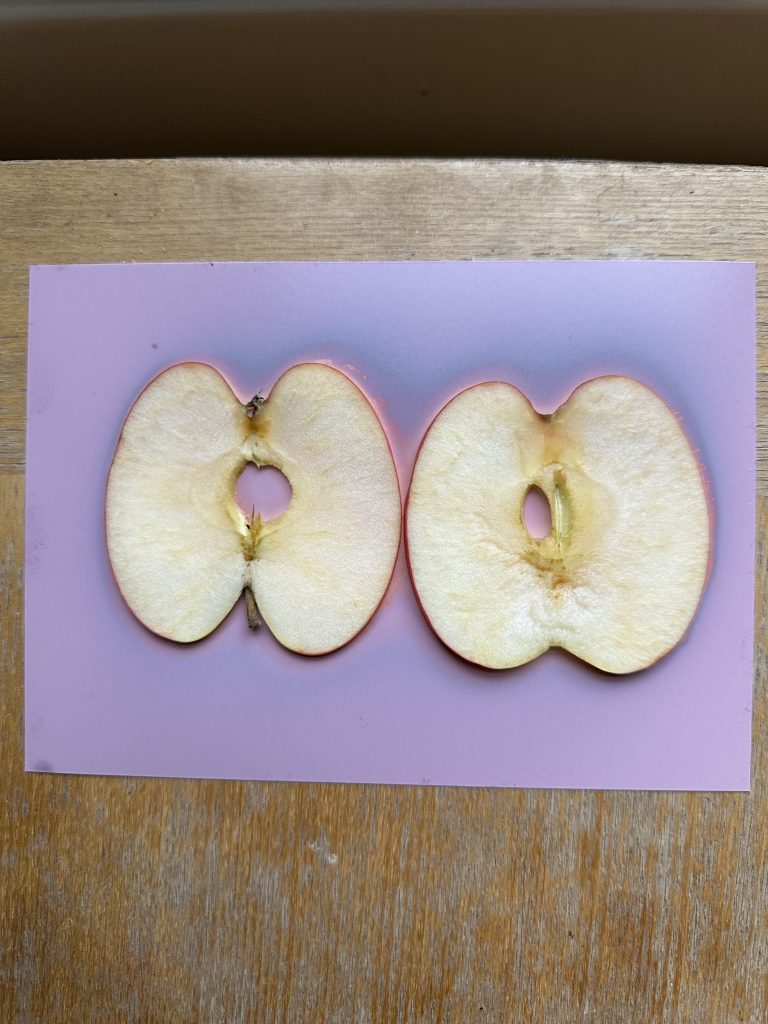
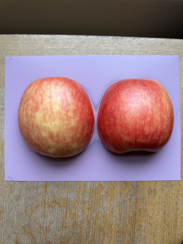
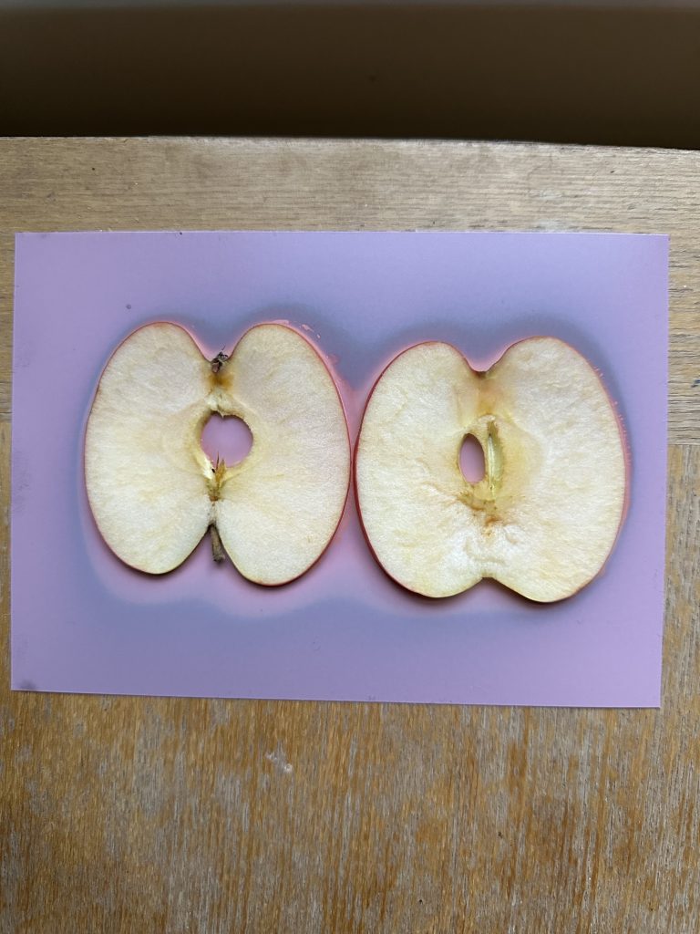
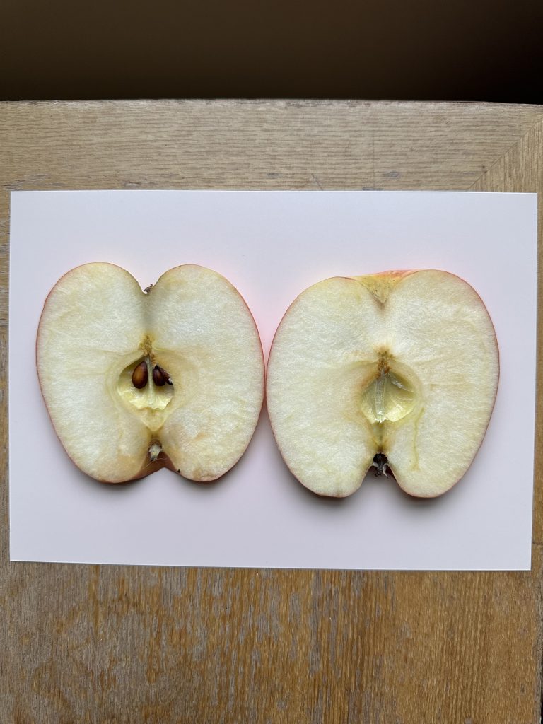
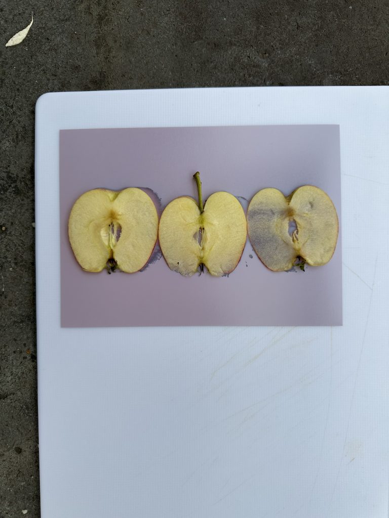
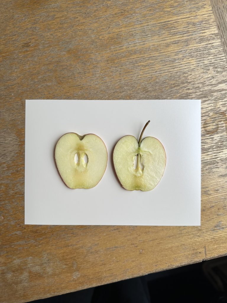
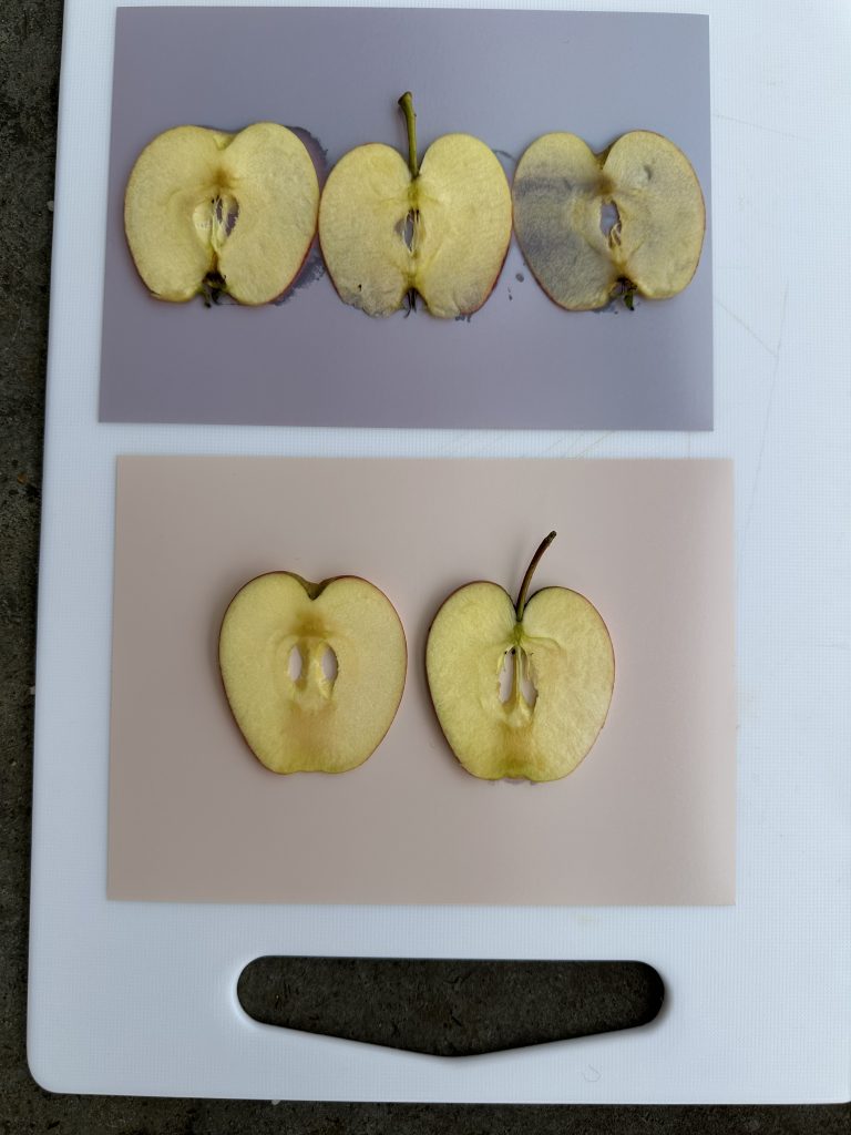
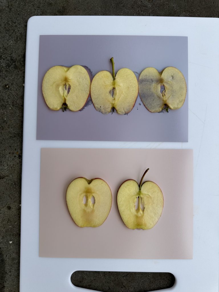
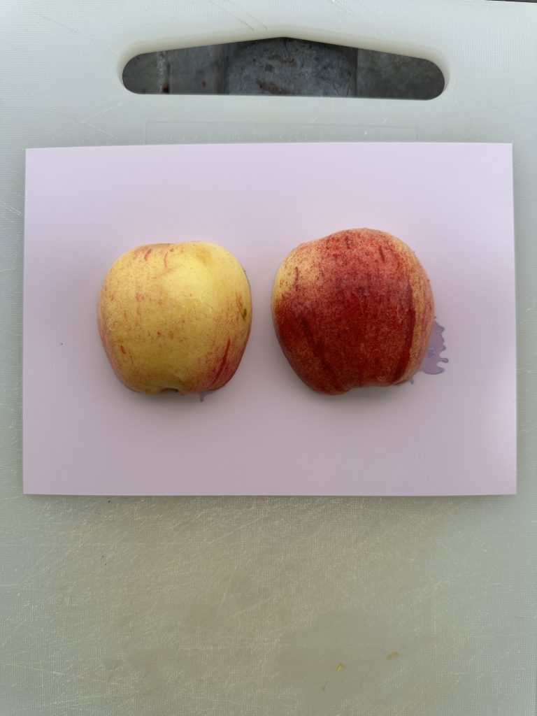
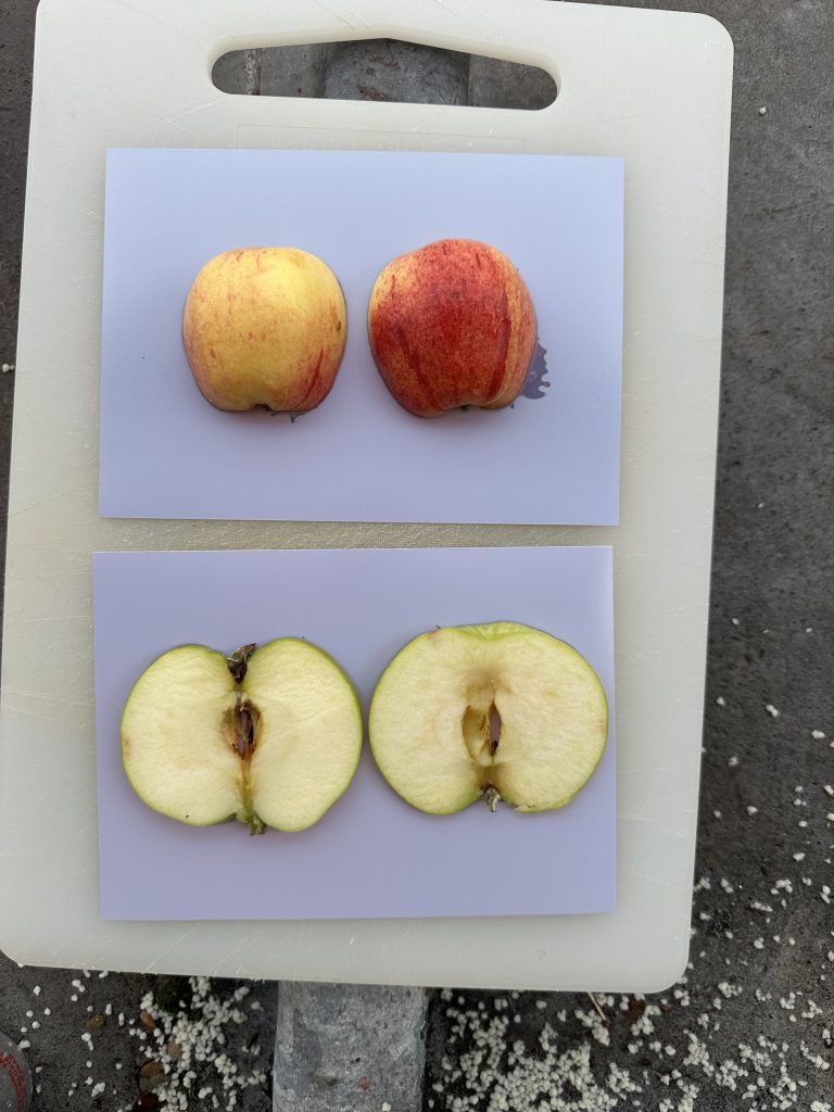
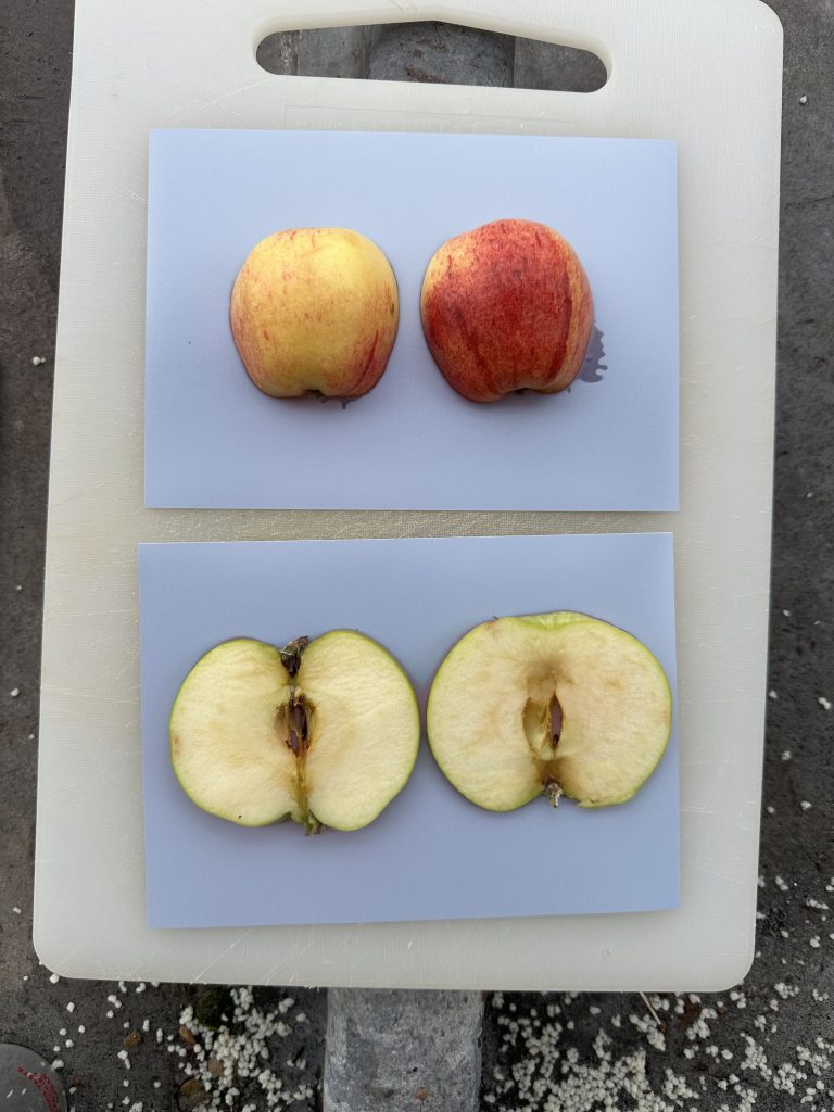
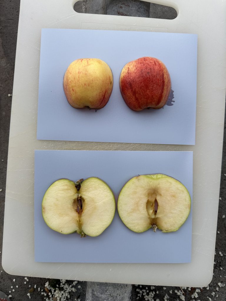
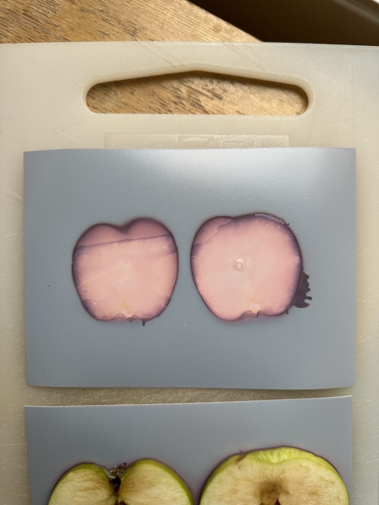
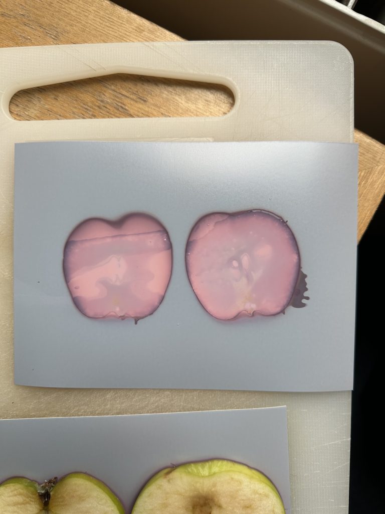
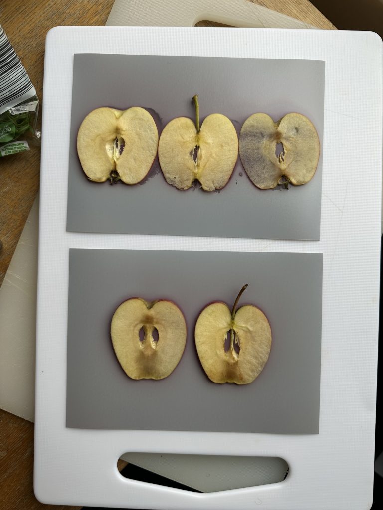
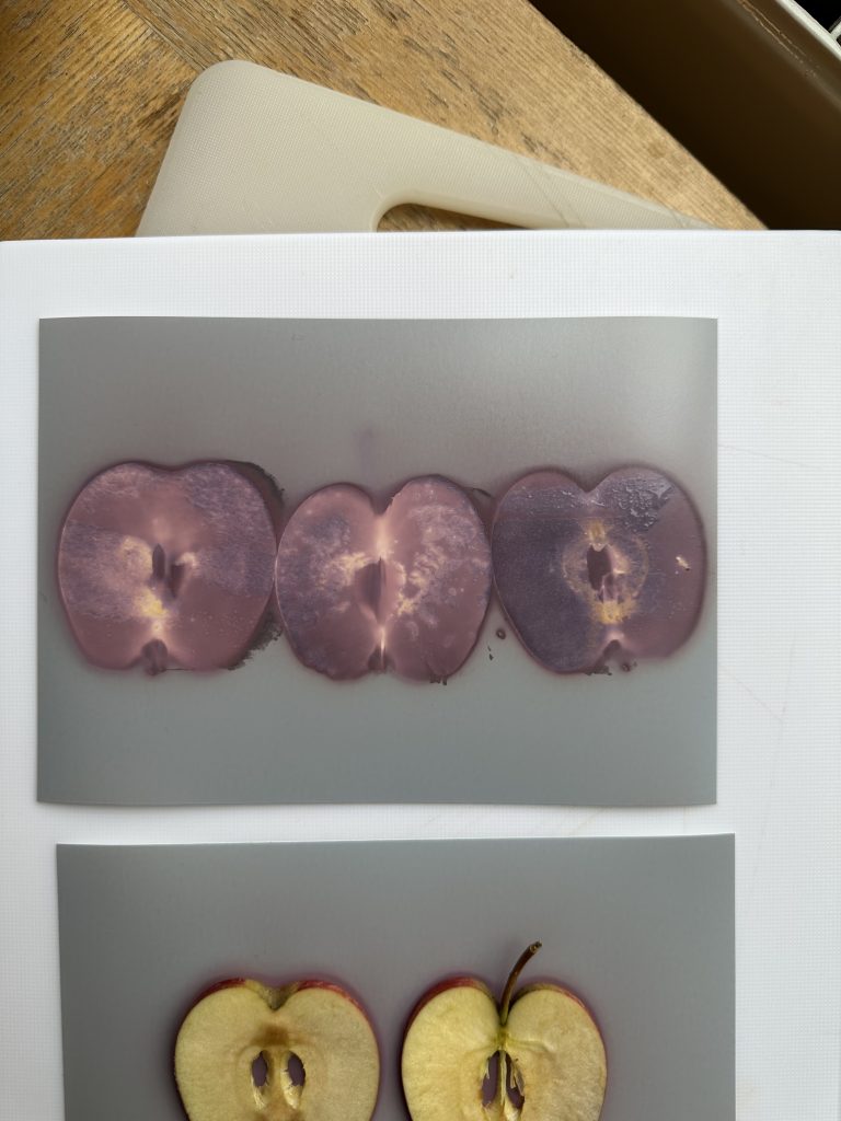
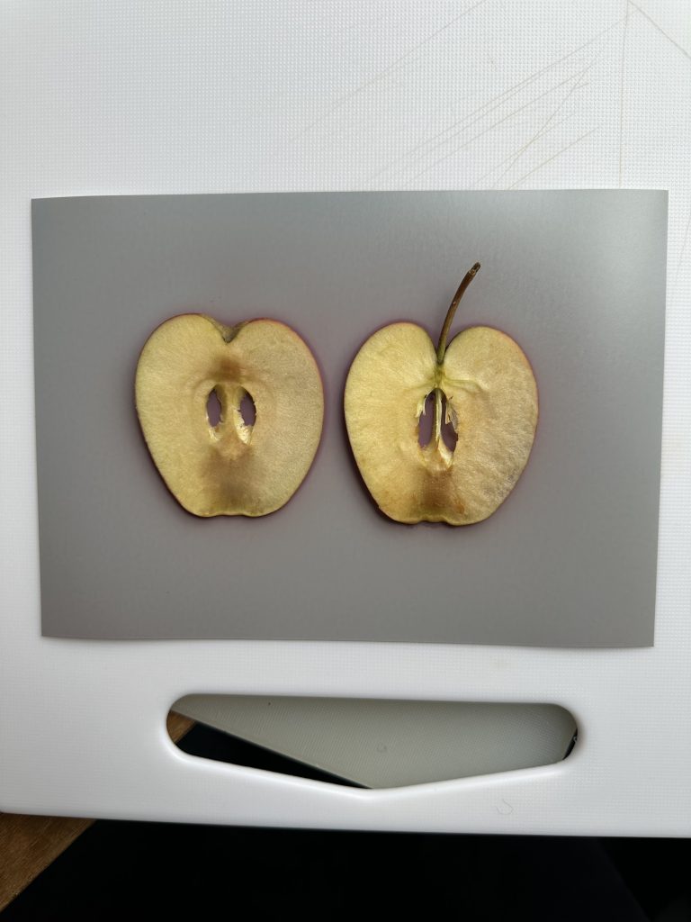
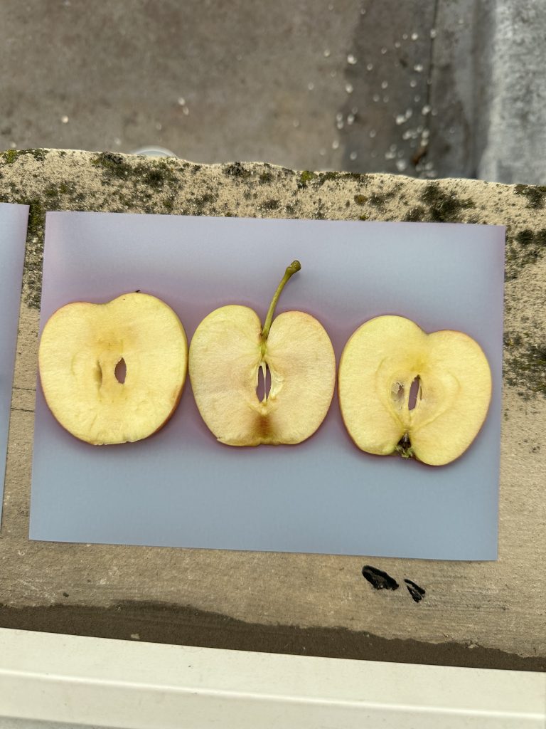
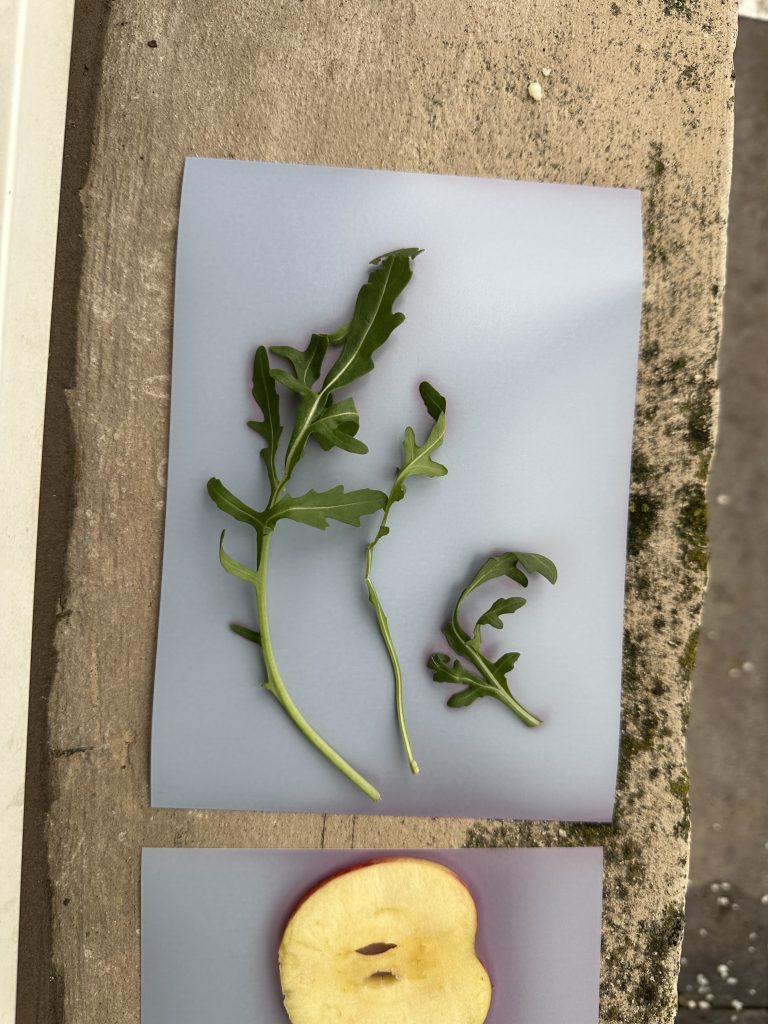
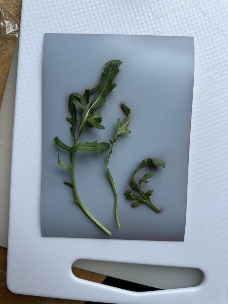
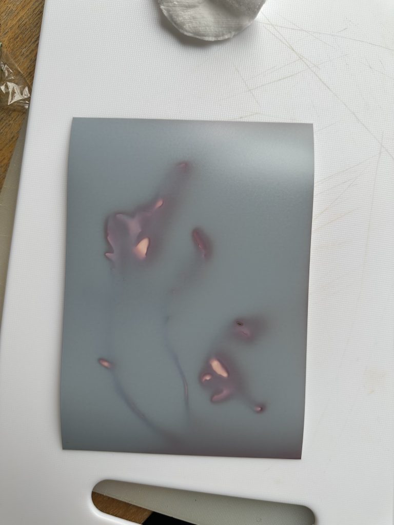
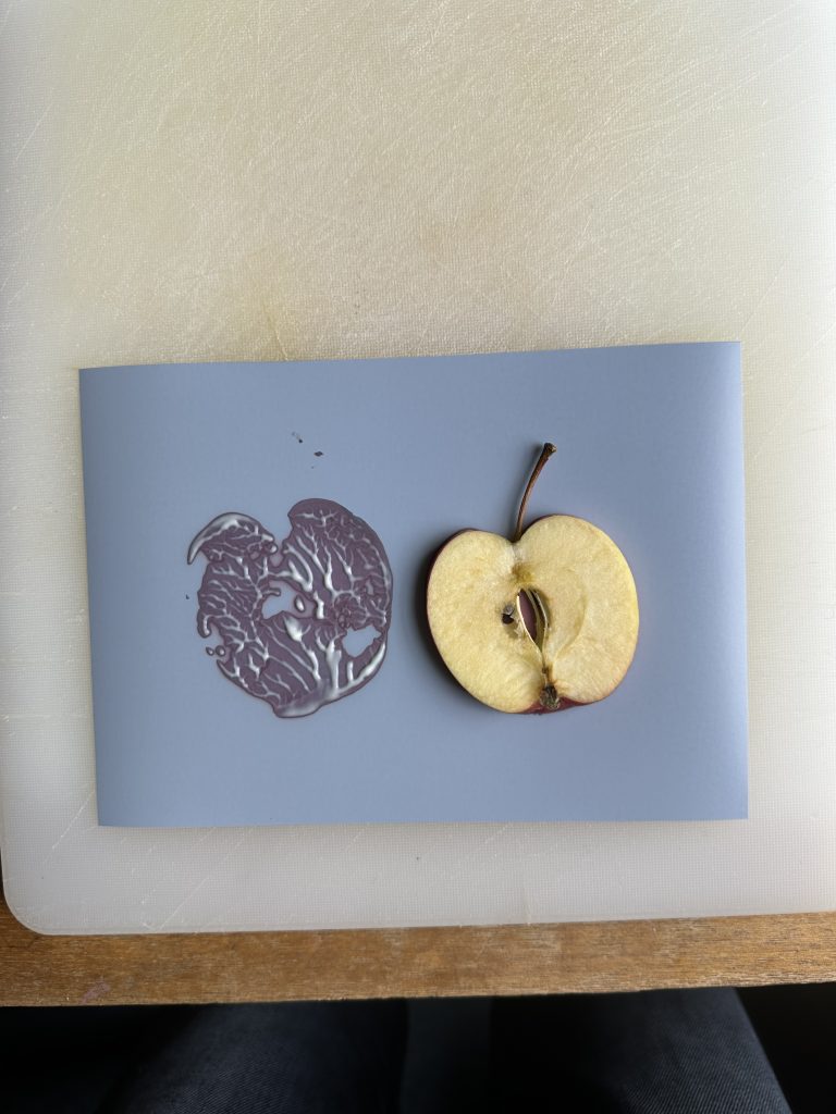
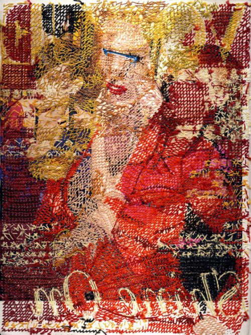
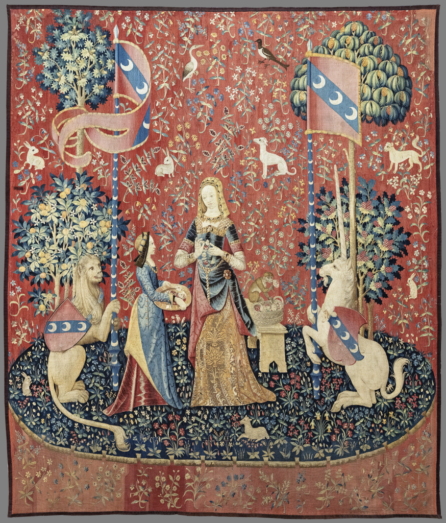
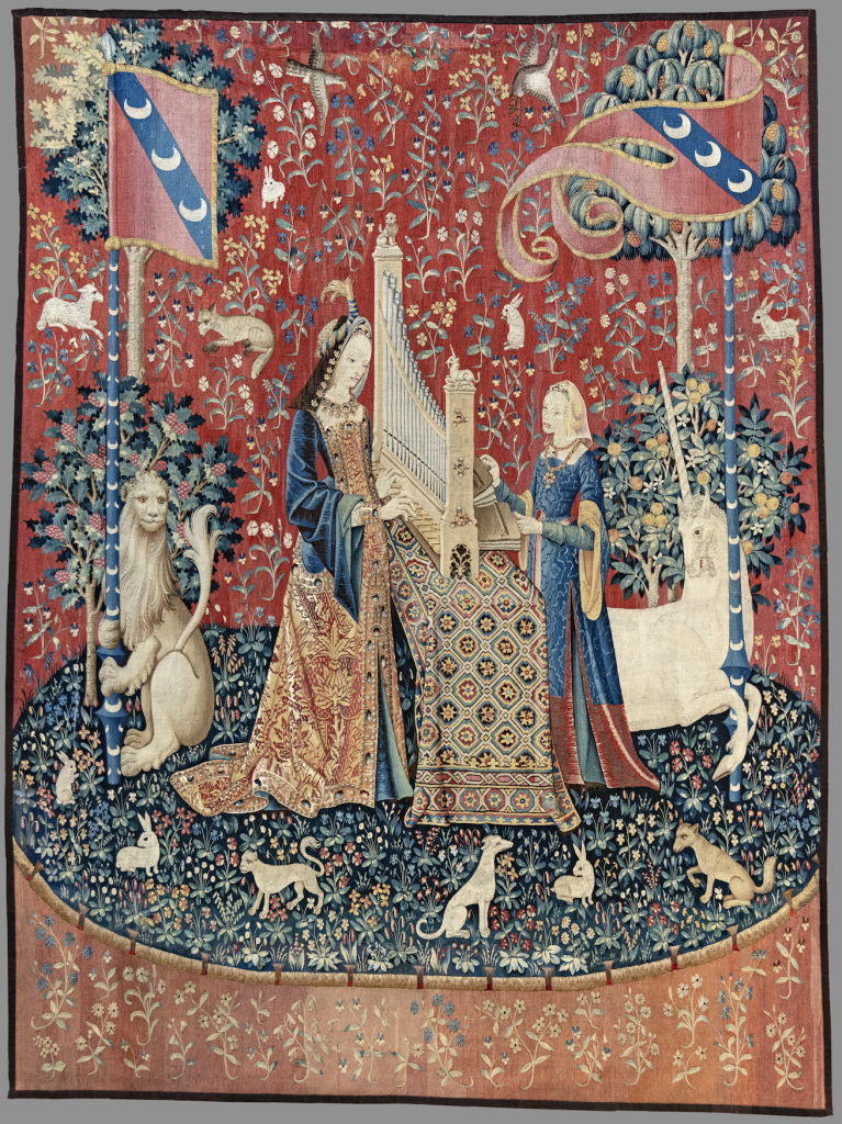
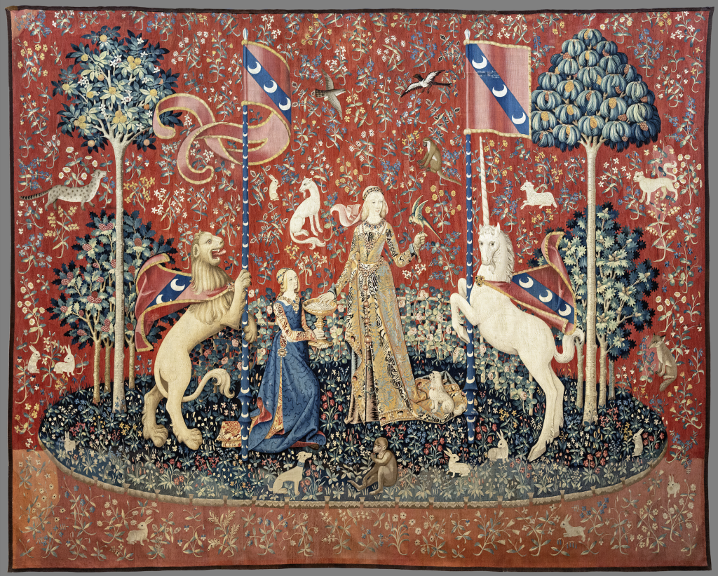
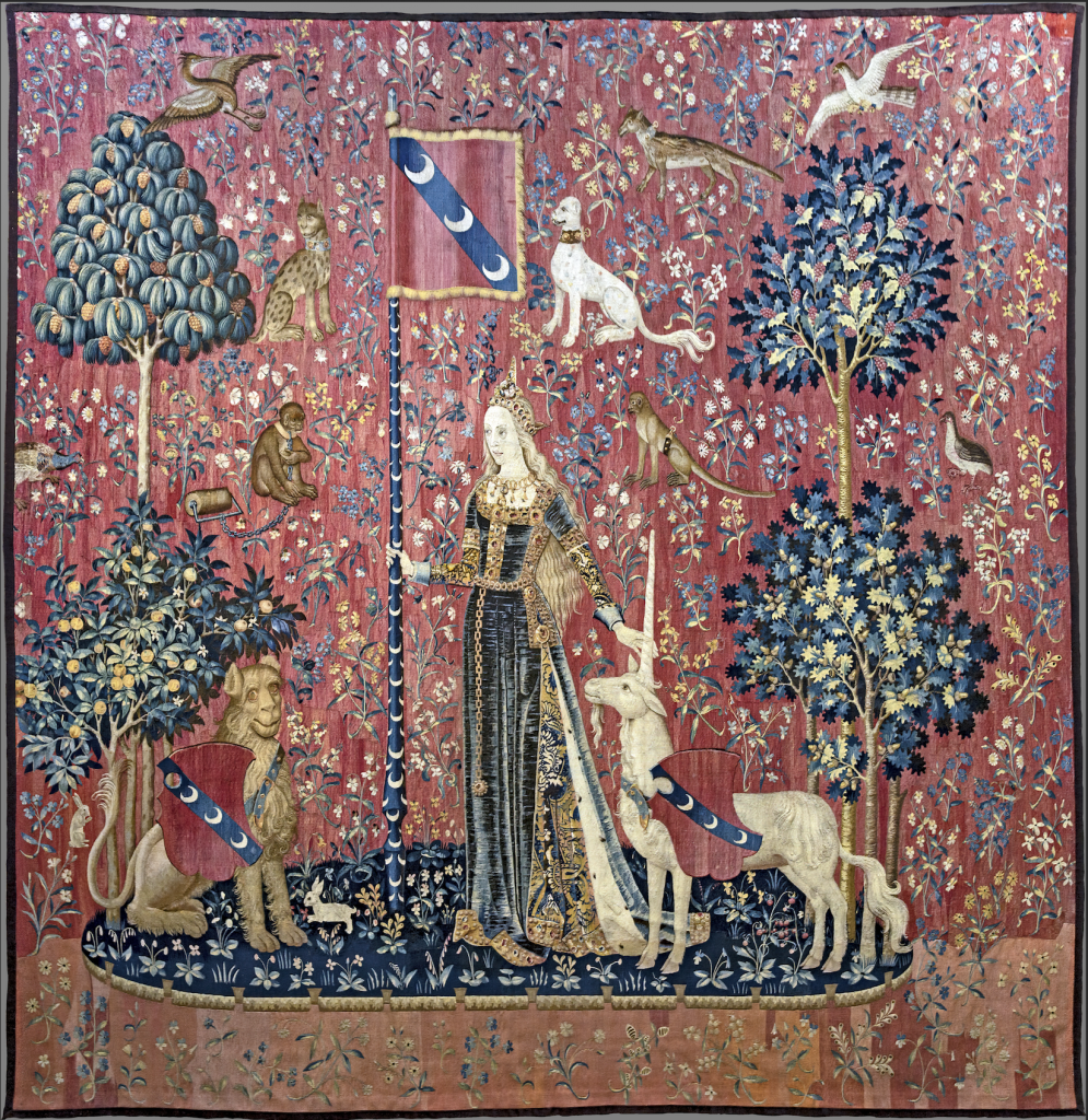
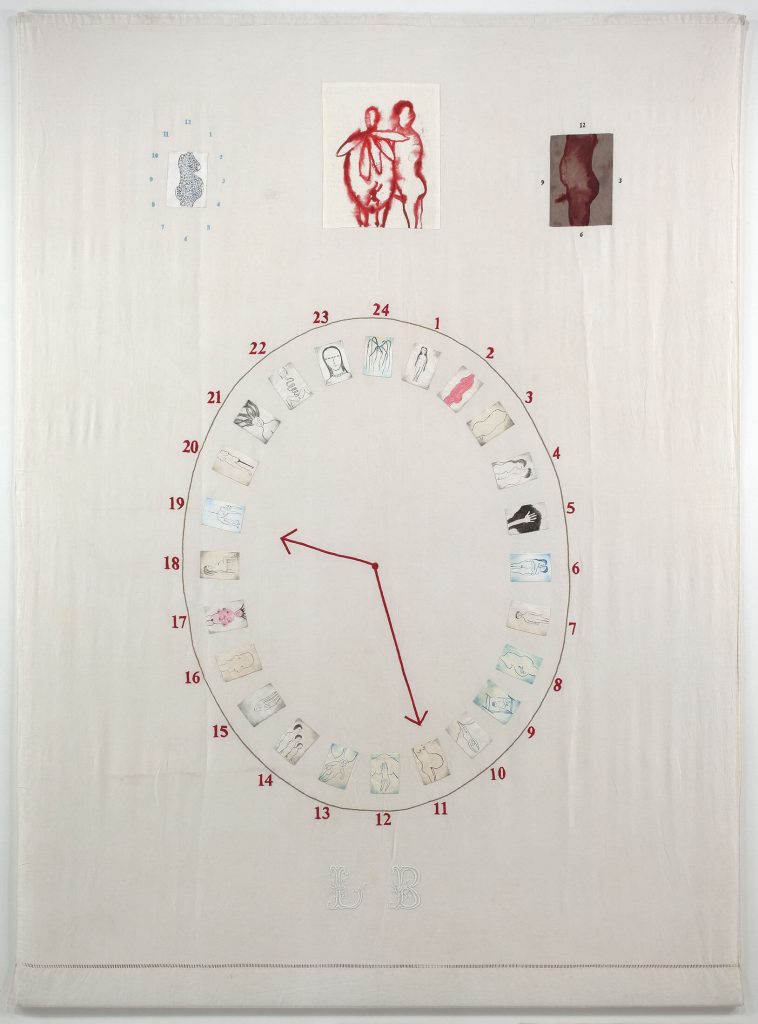
    Embroidery, traditionally being a community activity shaped the way we worked as a group. It became a collective practice where we exchanged skills and learned techniques from scratch throughout the process. It also facilitated decisions, tasks distribution and experimentation. Embroidery was the best way to work with waste materials and translate data into a visual language.

    References from the reading list

    • Blauvelt, A., Maurer, L., Paulus, E., Puckey, J. and Wouters, R., 2013. Conditional Design Workbook. Amsterdam: Valiz.

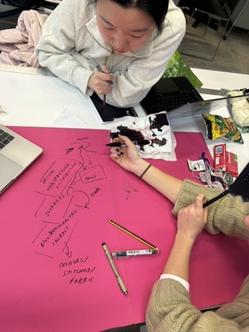
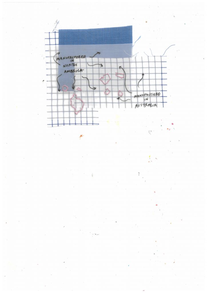
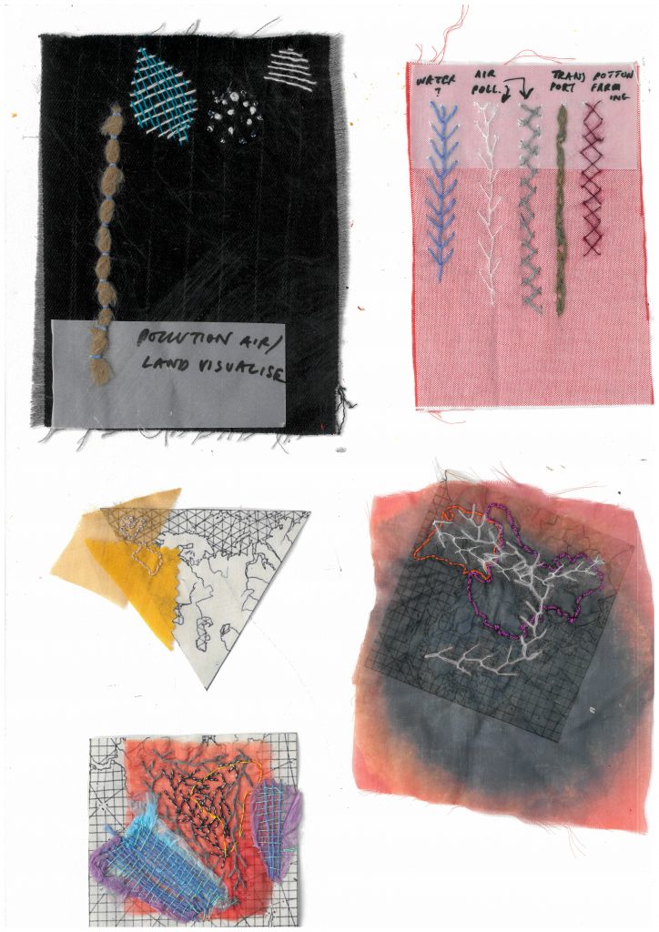
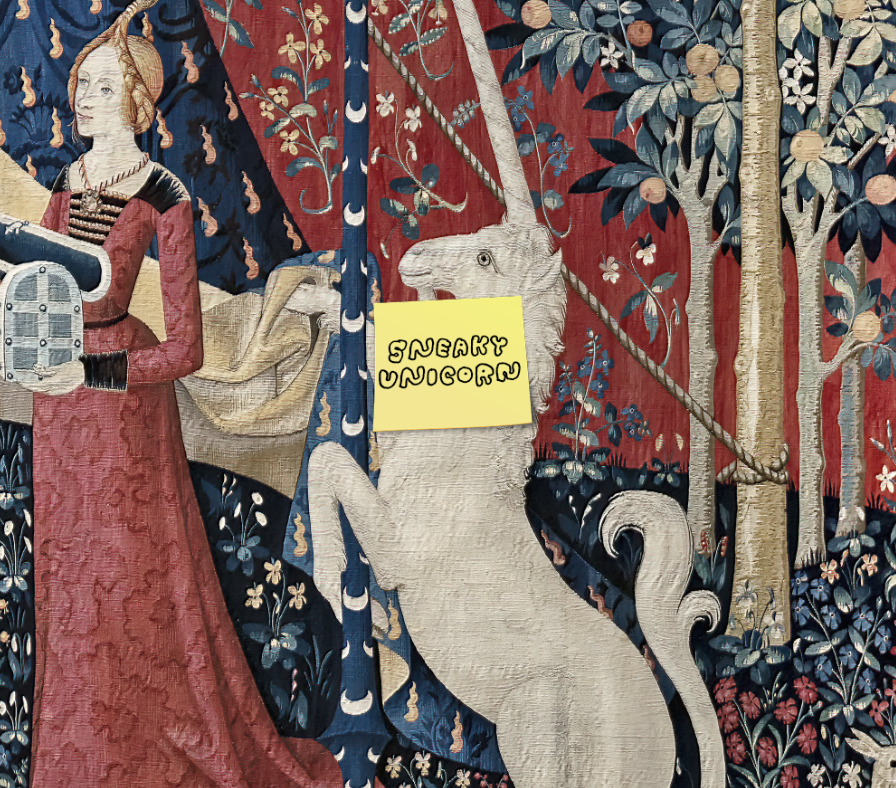
    Echoing the example of the imaginary city of Zhiango from the Conditional Design Workbook, built entirely through a defined set of rules, we established our own framework to construct the map. One of our core rules was to work exclusively with waste materials, turning limitation into a generative constraint. We selected specific types of pollution and translated them into visual references, but instead of transferring exact numerical data, we chose to interpret it through personal perception and understanding. 

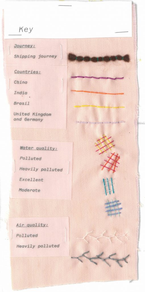
    We established a frame with the embroidery hoop and created a key that assigned different stitches, colours, threads, and fabrics to particular forms of pollution and locations. This system guided our process while allowing space for subjectivity. The reused materials themselves carried meaning, reinforcing the theme of sustainability. As the three of us worked simultaneously within these shared rules, the outcome was even more unpredictable and started reflecting the complexity of data representation.

    • Anderson, B., 2006. ‘Census, Map, Museum’. In: Imagined Communities. London: Verso, pp. 163–185.

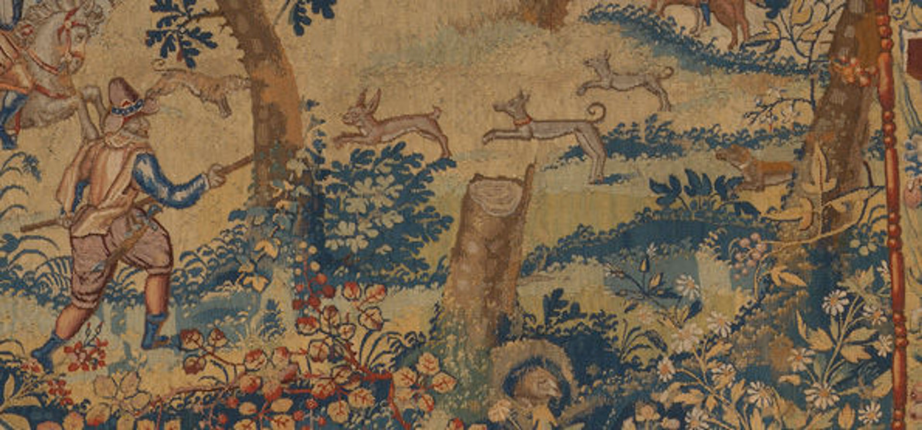
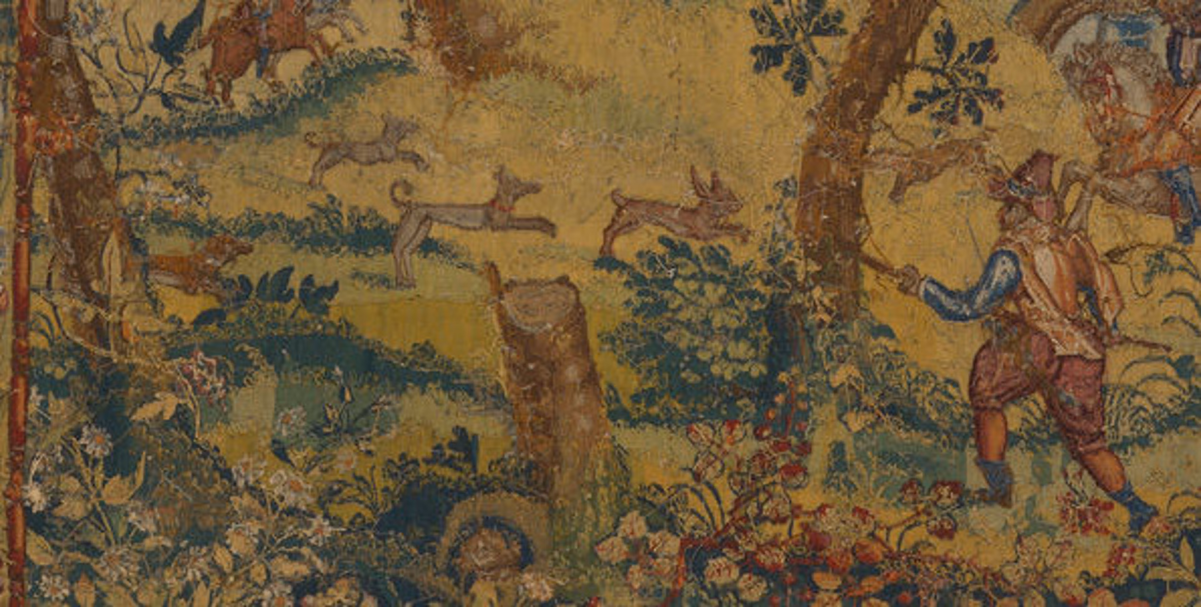
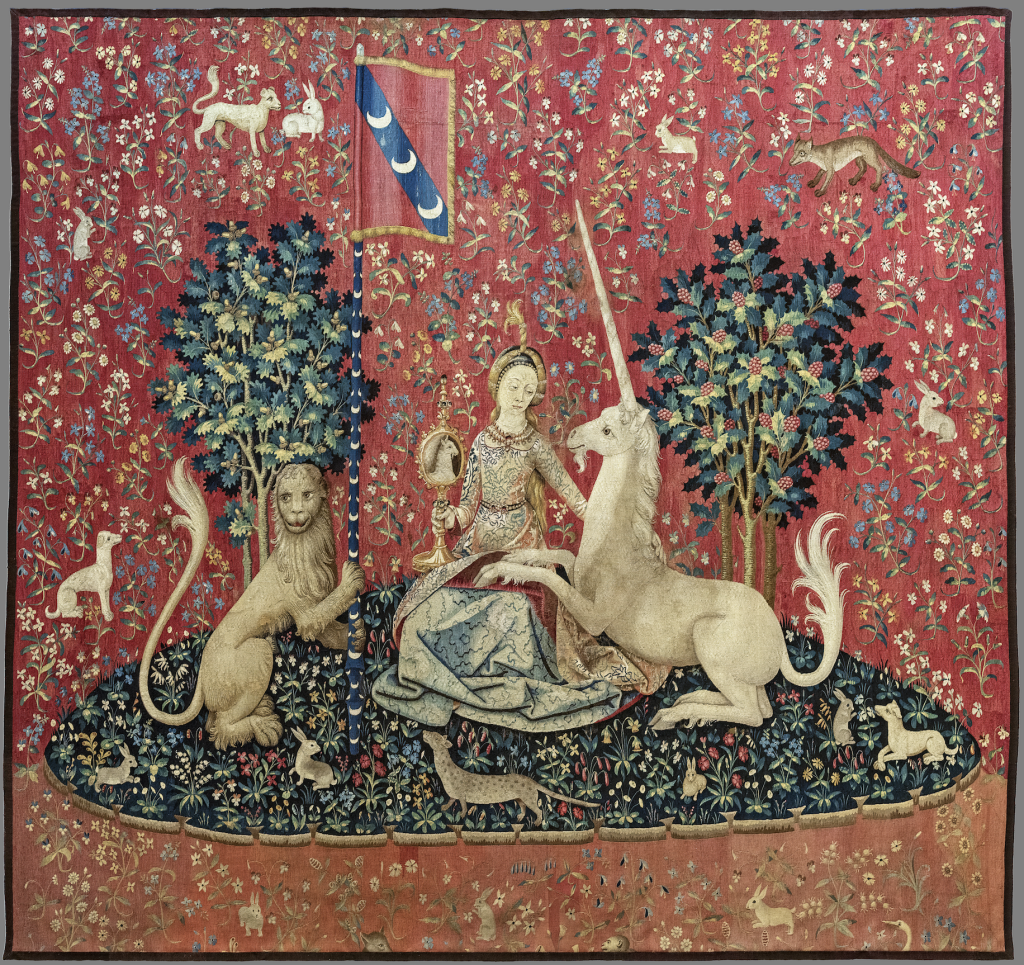
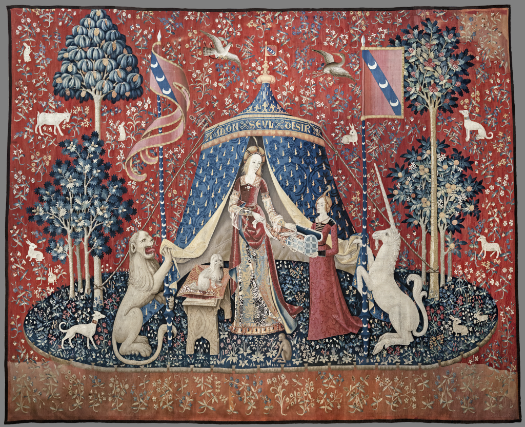
    This text compares colonial cartography and Siamese mapping traditions reveals how differently realities can be constructed through maps. The widely used Mercator projection, developed during European expansion, reflects a colonial worldview. In contrast, historical maps from Siam (present-day Thailand) operated within entirely different frameworks and didn’t show any invisible borders formalised by colonising powers. One form, the “cosmograph,” symbolically represented the Three Worlds of Buddhist cosmology, depicting heavens and hells rather than territory. And other maps functioned as guides for military campaigns or coastal navigation, combining multiple perspectives and lacking a fixed, unified geographic scale. They were relational and purpose-driven.

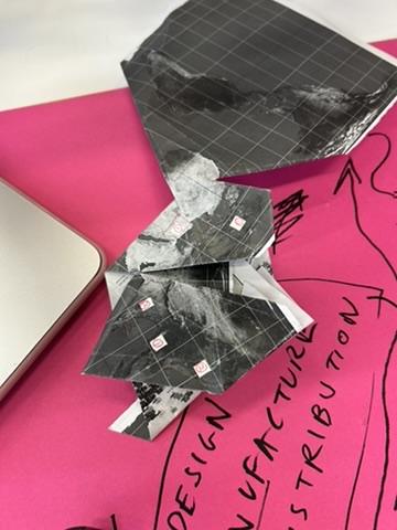
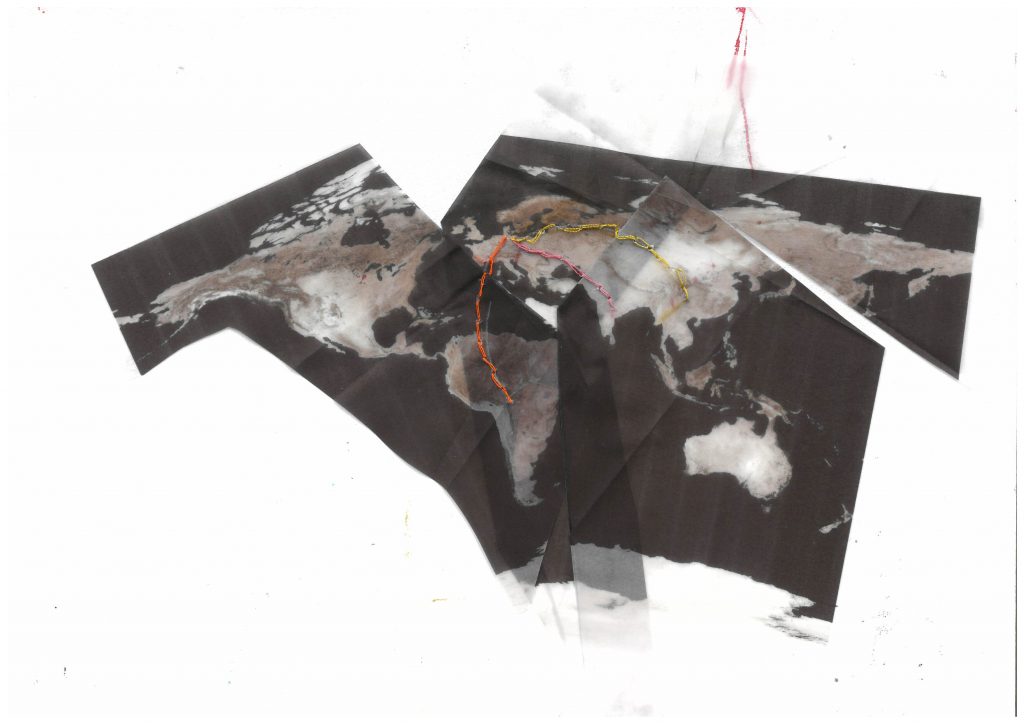
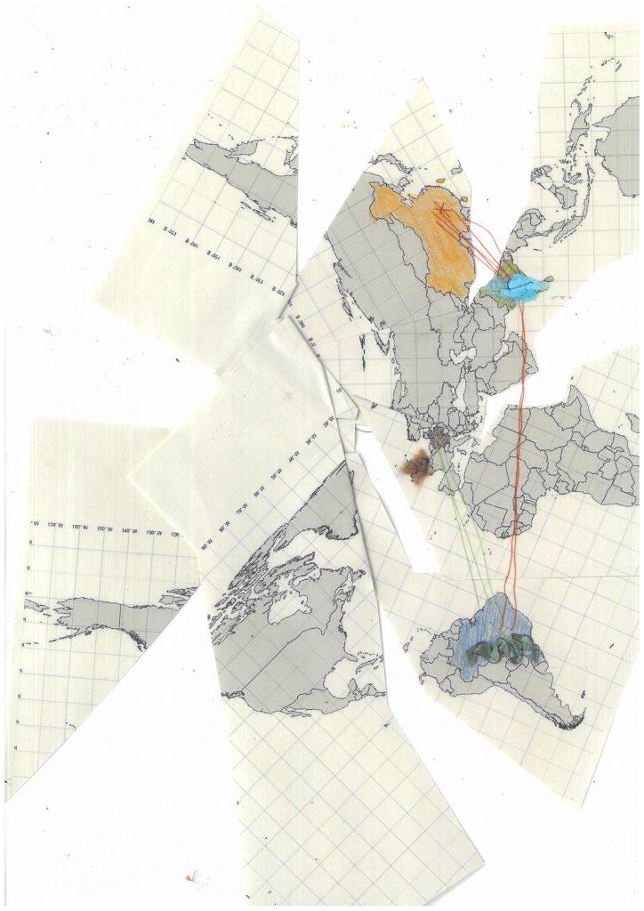
    These examples demonstrate that maps do not have to reflect reality to be understood, they can construct it. Recognising that the world map we commonly use is rooted in a colonial logic, we chose to distance ourselves from the Mercatorian view. Instead, we worked with the Dymaxion map, folding and cutting it, layering information to disrupt habitual perceptions and propose alternative understandings.

    References outside the reading list :

    • Leach, A., 2023. The World Is on Fire but We’re Still Buying Shoes. London: Profile Books.

    This book examines our collective addiction to fast fashion and the contradiction between awareness and action. Even when we know the environmental and social damage behind clothing production, consumption remains normalised, convenient, and emotionally driven.

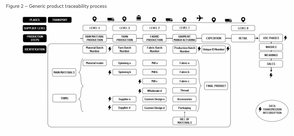
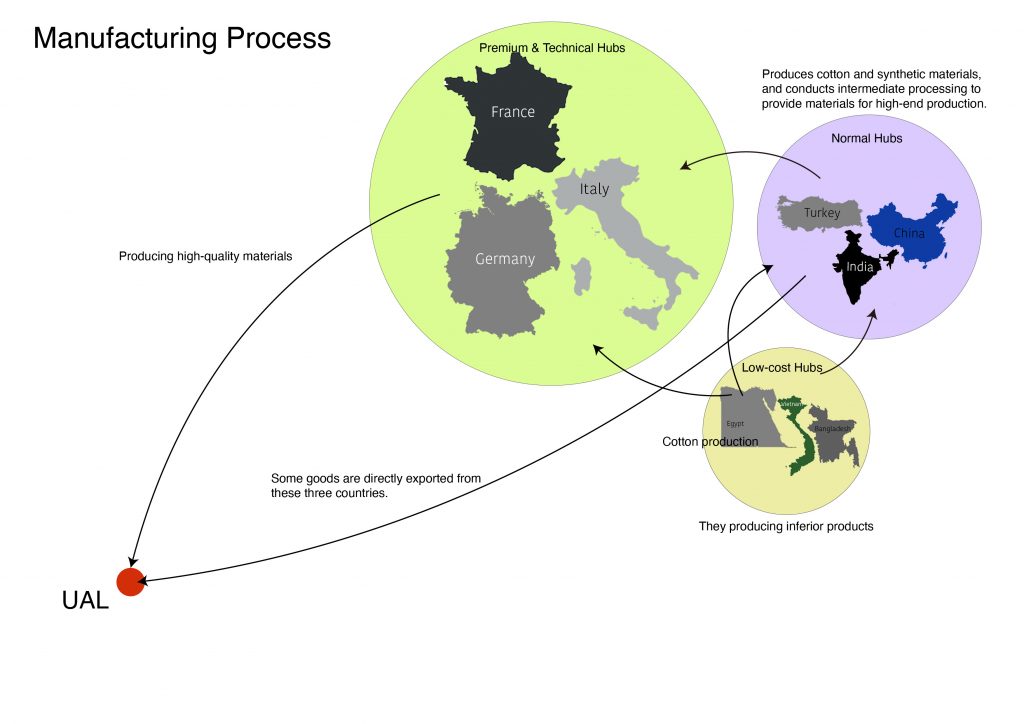
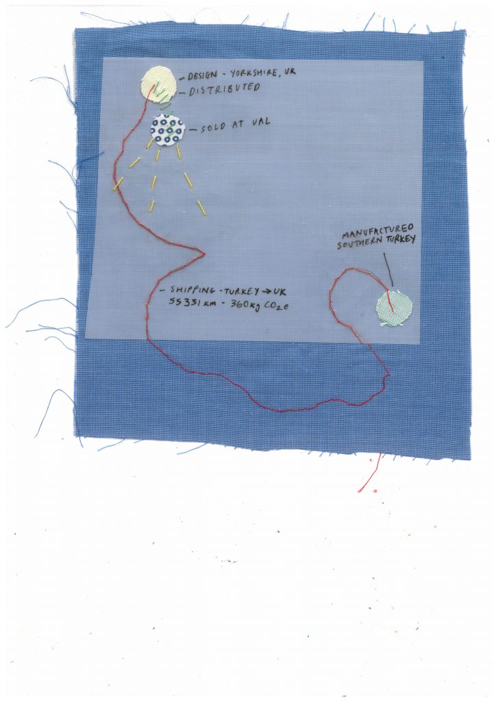
    But the thing is, we never really know what happens and to what extent. The book explains the lack of information and questions responsibility in sustainability, particularly the role of major fashion brands. Labels that proudly state “Made in Italy” often refer only to the final stage of assembly, while the materials may have traveled across multiple countries before reaching that point. The earlier stages from raw material extraction to sewing— are frequently outsourced to places where labor is cheaper and regulations weaker. By shifting production to wherever costs are lowest, companies avoid long-term accountability for workers’ wellbeing and environmental impact, while still marketing an image of quality and sustainability. 

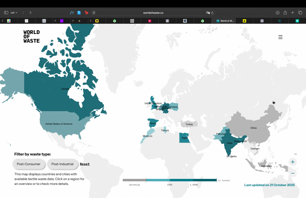
    This is why we chose to represent all this data that is not explained on the labels. We highlighted the hidden complexity of the textile life cycle, exposing how global supply chains obscure responsibility and distance individual consumers from the true cost of what they wear.

    • Pater, R., 2016. The Politics of Design: A (Not So) Global Design Manual for Visual Communication. Amsterdam: BIS Publishers.

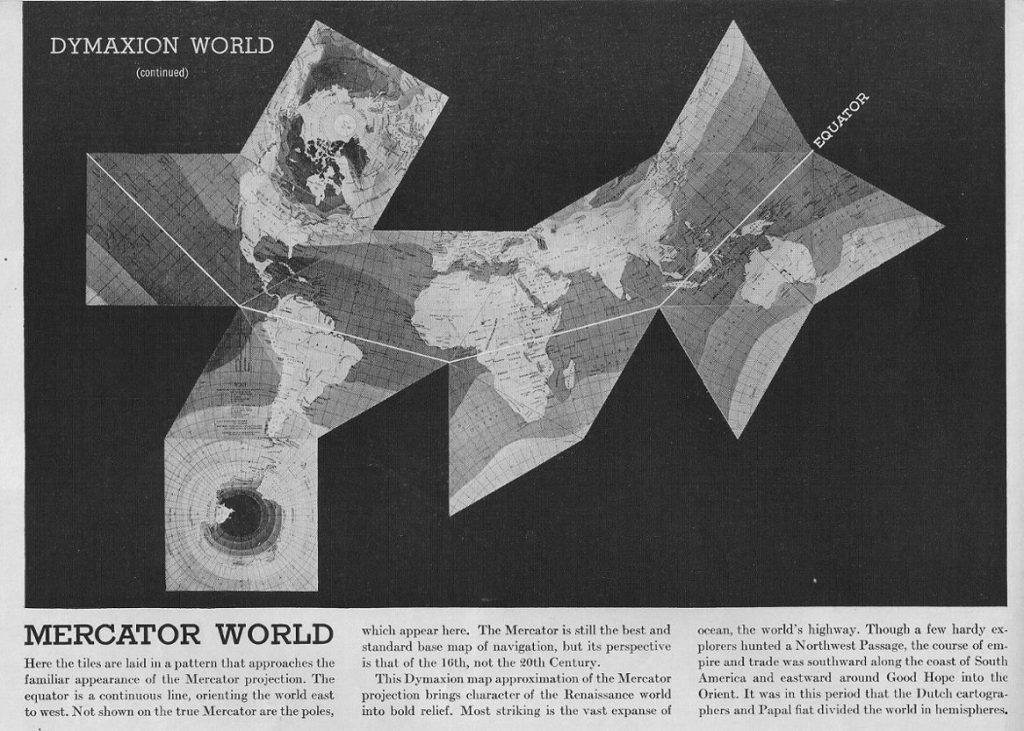
    A chapter of this book explores how world maps are never neutral representations of reality. Modern cartography developed alongside colonial expansion, when European powers mapped territories in order to control, divide, and claim them. Choices of projection, colour, scale, and even font size can subtly reinforce hierarchies, highlight certain regions, and marginalise others. A map may appear objective, but it always reflects particular intentions and ideas to the point of having an impact on world politics.

    Because it is impossible to accurately project a spherical globe onto a flat surface without distortion, every world map involves compromise. The Dymaxion map, developed by Buckminster Fuller, attempts to minimise these distortions by unfolding the globe, challenging conventional dominant countries and putting into perspective the distance between them. So we started using this map, but continued deconstructing it, transforming it into something abstract, that doesn’t correspond to geography standards anymore.

    The chapter also highlights ingenious mapping traditions from Indigenous communities, such as navigational charts based on ocean swell patterns, which questions Western standards of accuracy. Ultimately, maps and graphics shape understanding: altering scale, movement, or physical form can dramatically transform how data is perceived and interpreted.

    Design practices :

    • Deutinger, T. (2019) Ultimate Atlas: Logbook of Spaceship Earth. Zurich: Lars Müller Publishers. 

    This book demonstrates that almost anything can convey information when framed within a clear context. Using only lines and brief texts, Deutinger creates complex visualisations that communicate diverse forms of data. His minimalist, black-and-white graphics represent topics ranging from the size of countries to the distribution of crops across the planet. Rather than relying on numerical labels, many of the graphs operate through comparison and proportion, encouraging an intuitive understanding of scale.

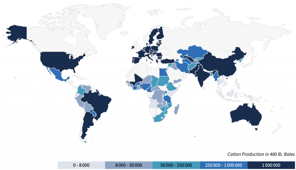
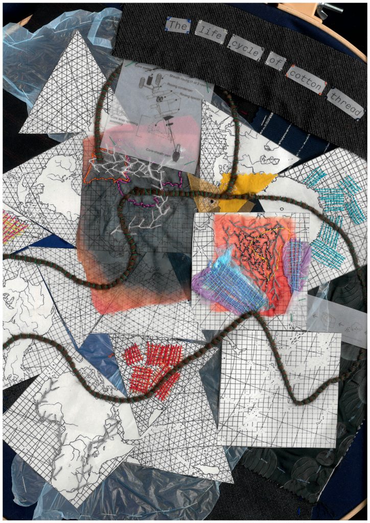
    The book proposes a new logic of reading, distinct from conventional cartography. Instead of prioritising geographic accuracy, he prioritises narrative logic. He completely changed the standards of graphics we are used to and took the approach of simplifying information as much as possible into different images. On the other hand, we chose to show the complexity of the world by selecting one single article from the shop to show full extent of its lifecycle, even if it means not representing the figures mathematically. We layered all the data we could find around to show the whole scale of its impact.

    • Lee Mingwei, The Mending Project, 2009, Mixed media interactive installation. Tables, chairs, thread, fabric items. unique (1/1) + 1AP

    This project is an interactive installation in which the artist employs simple elements like thread, colour, and sewing as starting points to explore relationships between people, objects and their environment. Visitors were invited to bring damaged textile items to be mended during the exhibition, transforming repair into a performance and placing textile in the center. By encouraging participants to care for the garments they valued, the project directly addressed waste and responsibility within textile culture.

    The threads used for each repair were left uncut until the exhibition ended. Over time, they accumulated into a layered web stretching across the space. This entanglement visually mapped the complexity of connections between people and their clothes.

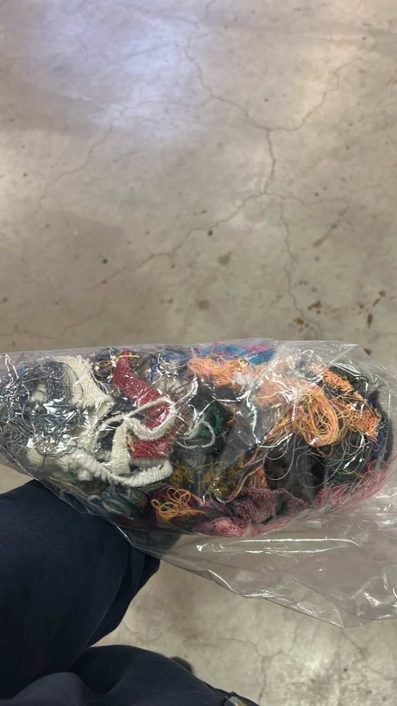
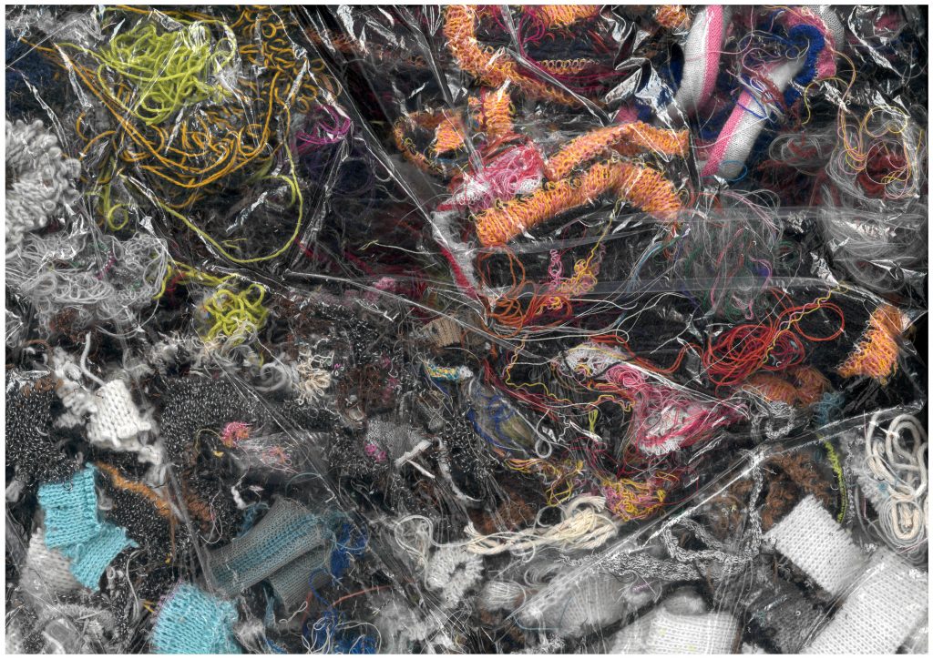
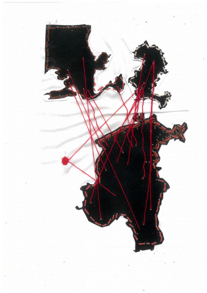
    In our own work, we also used thread as a connecting device, but to trace global shipping journeys between countries. By linking locations with stitched lines and reusing textile waste collected from bins across the school, we highlighted the environmental impact of production and disposal, exposing the layered consequences of textile consumption.

  • Written response 4.0

    I printed this picture while writing on a transparent paper with a black opaque marker. The sun imprinted the paper while writing so the top part is more contrasted because more exposed and tho bottom part more blurry because more recent. My Text was a performance .

    Draft 3 rendering

    I made this publication completely analog as a part of the performance : the pictures are not fixed and will continue fading when looking at them.

  • Lumen prints

    Moholy-Nagy, L. (1925–26) Photogram. Photograph.
    Jerry Burchfield. (2000–2001) Roadkill, lumen print.
    John Fobes. Lumen Print 1093 Three Apples, lumen
    print (Forte Polygrade RC 8Å~10 in. paper).
    Sugimoto, H. (1995) Al Ringling Theatre, Baraboo. Gelatin silver print.
    Huguenin, D. (1981) Autoportrait (La filature). Black and white photographs with photocomposed text. 112.5 × 166 cm. Carré d’Art – Musée d’Art Contemporain, Nîmes.
  • Written response 3.0

    A poor image is the ghost of an image. It is an image that followed a process at the expense of its own meaning, changing its focus. From being uploaded to downloaded and shared, images undergo systematic modifications where the outcome is uncertain and uncontrolled (Steyerl, 2012, pp. 31–45).

    I chose to explain Hito Steyerl’s In Defence of the Poor Image according to the Conditional Design Manifesto from the Conditional design workbook . This manifesto explains the concept of conditional design where the approach is more valued than the chosen media, where graphic design becomes a tool or an instrument. Because conditional design is about designing design, workshops are described as games, with a set of conditions and rules.

    I translated Hito Steyerl’s text into a workshop game to demonstrate the transformative and collective method of creation of poor images.

    Workshop
    IN DEFENSE OF THE POOR IMAGE

    X Play with multiple participants. X The game takes place in a world that idolizes high-quality images

    1, • Preparation
    1.1, Choose an original, fixed image.

    2, • Circulation
    2.1, Make it circulate outside official economies — on file-sharing platforms, torrents, or social media.
    2.2, Make it mutate : copies, downloads, and reshares add layers of translation and context.
    2.3, Challenge aesthetic and economic hierarchies : poor images are democratic in access but highlight global inequalities.
    2.4, Encourage collective circulation rather than fixed ownership, like artworks confined to museums.

    3, • Transformation
    3.1, Each copy may alter contrast, color, or size.
    3.2, Every degradation or glitch adds history, authorship, and survival value.
    3.3, Resist the art world’s obsession with perfection, and exclusivity.

    4, • Hierarchies of Resolution
    4.1, Prevent high-resolution images from dominating the space.
    4.2, Prioritize communication and movement over perfection.
    4.3, Bring marginalized or radical visual cultures to light, instead of relegating them to the digital margins.
    4.4, Defend access, democracy, and the right to visual culture against corporate and institutional control.

    5, • Politics of the Poor Image
    5.1, Mirror the precarious conditions of cultural workers and the commodification of media.
    5.2, Make the images migrate: cross borders, languages, and formats freely, like displaced or fragmented communities.
    5.3, Make it visual form of resistance — preserving political cinema, marginalized histories, and ideas excluded from mainstream distribution.

    6, • Endgame
    6.1, The game ends when the original is untraceable.
    6.2, The poor image survives through circulation and movement.

    Outcome :
    The poor image is a low-resolution, often pirated or compressed copy of an original work. Its “poverty” does not diminish its cultural or political power; rather, it embodies access, circulation, mutation, and collective authorship. Poor images become living archives, resisting control while connecting communities and histories across space and time.

    References :

    – Maurer, L. (2013) Conditional Design Workbook. Amsterdam: Valiz, pp. ii–xiv.

    – Steyerl, H. (2012) In Defence of the Poor Image. In: The Wretched of the Screen. Berlin: Sternberg Press, pp. 31–45.

  • Week 7 : weaving

    I tried parodying a modern magazine cover to highlight societal expectations placed on women’s bodies.

    Modern interpretation using post notes.

    Feminist collage in Paris

    I tried to mimic the protest signs against feminicides.

    The Story of the Buzzard, 1480-1490, Unknown artist, Strasbourg

    I kept the original tapestry intact and made my drawings as seamless as possible. My aim was not to change the image, but to reveal its underlying meaning. The illustrations blend into the mille-fleurs and the animals, becoming part of the tapestry’s language rather than disrupting it. So I took inspiration of how they tell the story in The Story of the Buzzard tapestry.

    Tried drawing like weaving the tapestry, to modifie it.

    First outcome

    Du ring my research for the magazine cover experiment I went upon this artwork which lead me to do more research on the back of tapestries. I learned that conservators often turn to the back of the textile during restoration. Protected from light exposure, the back preserves pigments that are significantly more accurate than those on the faded front. In this sense, the reverse becomes the most authentic record of the tapestry’s original appearance.

    Anonymous Flemish weavers. Hunters in a Landscape, ca. 1575–95. Wool, silk; The Metropolitan Museum of Art, New York.
    LionBearer of honor — courage bound to the world of men.They praise his courage — I carry mine in secret.
    GoatInstinct tamed by grace.Instinct trimmed to please.
    Rabbits Life renews itself in silence.Life blooms but I must hold my tongue.
    Pine treeEver green, it holds the promise of return.I too remain evergreen — enduring through the seasons of forgetting.
    Sitting dogPatience at her feet, the faithful heart that waits.I refuse meekness — I bite when I must.
    PavilionThe pavilion holds the moment between wanting and wisdom.This is my space, desire lives here on my terms.
    DogBound in service yet loyal by choice.I am loyal only to myself.
    LambSacred meeknessVirtue becomes mockery
    UnicornThe unicorn bows to innocence, a mirror of purity untainted by desire.He honors only the restraint I show, while ignoring all that makes me alive.
    MonkeyPlayful temptationPlayful, until they call it sin.
    LadyShe chooses, not through desire, but through will, the soul governing the senses.Every symbol around me whispers lust. They call me innocence.

    Transforming the tapestry’s traditional symbols into the Lady’s own voice reframes her from a passive emblem of virtue into a conscious, resisting subject.

    The Lady goes from witness to critic of the double standards : surrounded by animals, flowers, and erotic symbols, she is still treated as a “pure” object.

    An exhibition designed so visitors can move freely around the tapestry, allowing them to approach its details up close and view both the front and the back.

  • Week 6 : lots of research

    Tapestries woven in the Middle Ages were mainly intended to decorate civil residences and religious buildings.

    Initially inspired by religion to educate the people, medieval tapestries became more prestigious towards the end of the 14th century, depicting stories illustrating the life of their owner. They were arranged in sets. The Bayeux Tapestry and The Lady and the Unicorn are masterpieces of this period.

    The tapestries accurately reflect the social and political aspects of society in past times. They are images full of mystery that freeze time.

    The tapestry known as The Lady and the Unicorn is a series of six tapestries from the early 16th century. A masterpiece from the early French Renaissance, it is kept at the National Museum of the Middle Ages-Thermes and Hôtel de Cluny in Paris.

    Five of these representations form an allegory of the five senses, symbolised by the lady’s occupation :

    • Sight: the unicorn gazes at itself in a mirror held by the lady;
    • Smell: while the lady is making a crown of flowers, a monkey sniffs the scent of a flower it has picked.
    • Hearing: the lady plays a small organ.
    • Taste: the lady takes what could be a sugared almond from a cup held out to her by her servant and offers it to a bird.
    • Touch: the lady holds the unicorn’s horn in her hand, as well as the pole of a standard.

    The sixth tapestry, representing the sixth sense, can only be interpreted by deduction from the hypothesis of the five senses. Framed by the initials A and V or I, the motto ‘My only desire’ can be seen at the top of the blue tent.

    1. Translation of the language of heraldry

    My first method would be to translate literally what is represented on the tapestries using the iconology of old images where every tree, animal, object has a meaning, and the understanding of the coat of arms, their colours and symbols.

    2. My One Desire

    The sixth tapestry is still a mystery for historians. The phrase written on the tent can have different meanings in French. It can be translated as ‘My One Desire’ but also as ‘According to my will only’.

    Anagrams of the motto can also be found :

    DON LE URAI SEMS : Donne le vrai sens Give true meaning
    SENS AMOR DEUIL : Sans amour deuil Without love, mourning
    LE UI SENS D AMOR : Le VIème sens d’amour The sixth sense of love

    The tapestry raises many questions :

    • Could the sixth sense be the heart that governs all the other senses, as the theologian Jean Gerson wrote at the end of the 14th century? (The writings of the Chancellor of the University of Paris, Jean Gerson  (1363 -1429) mention ‘six senses – five external and one internal – namely the heart – which we must master as six schoolchildren.’ He sees the heart as the controller of the physical senses and needing to be schooled to avoid sins such as lust.)
    • Or, to quote a commentary from Plato’s Symposium, could it be the understanding, intelligence and beauty of the soul?
    • Is the Lady renouncing pleasure by placing the necklace in the chest?
    • Is the focus on the importance of moderation in all things, allowing one to enjoy sensual pleasures without becoming enslaved to them?

    3. The Lady

     The lady in the tapestry, with her lily-white complexion, ruby lips and golden hair, is a beauty whose praises have been sung in courtly literature since the 12th century. She is not a portrait of a woman who lived in the Le Viste household, but the embodiment of the ideal woman according to medieval standards.

    She isn’t the subject of the piece, but only an allegory of the senses, so what of her thoughts, her point of view and her desires?

    Bourgeois, L. (1992) Garment from the performance “She Lost It…”. [Artwork].

    Seeing this tapestry with a feminist point of view, made me think of Louise bourgeois’ work, as part of the ‘New Tapestry’ movement.

    The Jean Lurçat Museum of Contemporary Tapestry, in its exhibition ‘Tapestry? From Picasso to Messager’, examines the place and importance of this textile art, as well as its status in contemporary art. For female artists such as Louise Bourgeois, textiles have become a symbol of protest against their status in Western society.

    Bourgeois, L. (2009) Self Portrait. [Artwork].

    In this artwork, she explores life as a girl, woman, wife, mother, and artist, through her physical and emotional transformation as the hours advance.

    4. The unicorn

    Reuwich, E. (1486) Animals of the Holy Land, in Breydenbach, B. von. Peregrinatio in terram sanctam. Mainz: Erhard Reuwich.

    Unicorns were believed to be real animals in Medieval times. Some were supposedly spotted in Mount Sinai. Another print locates their native habitat in the Americas. Eminent scholars and explorers reported seeing this wild animal during their expeditions to distant lands, particularly India. However, it seems that the animal observed by the explorers was in fact the Javan rhinoceros, which has a horn on its skull.

    It was in the 12th century that unicorns became a symbol of purity. They were associated with the Passion of Christ and his sign of chastity. Its horn was believed to be an antidote to poison and could purify contaminated water.

    The belief was that only a virgin could tame a unicorn, with its reference to sexual innocence and experience

    The portrait of the creature is fierce, tender, and pure. He embodies matters of faith, as well as the heart. In wedding portraits, he represents the taming of the beloved.

  • Written response 2.0

    Michel Foucault’s Preface to The Order of Things : An Archaeology of the Human Sciences can be read as a catalogue in itself — a text that inventories systems of thought, names, and classifications (Foucault, 1989, pp. xvi–xxvi). Often described as a manifesto of structuralism, it stands against a certain form of humanism by dismantling the idea of a stable human subject and instead proposing the concept of the épistemè, the underlying structure that shapes what a culture considers knowledge at a given time (Foucault, 1989, pp. xvi–xxvi).

    In this sense, the Preface functions both as an introduction and as an inventory itself : Foucault lists his predecessors, maps intellectual lineages, and enumerates the methodological orders that have governed Western knowledge. His text mimics the very mechanisms he analyses. It is rhythmically built from sequences of repetition and accumulation :

    394 commas

    44 semicolons

    41 identifiable lists 

    5 repetitions

    punctuate the pages. 

    Terms such as 

    56 order

    8 classification

    6 enumeration

    6 system

    2 list

    recur like motifs, forming a linguistic taxonomy that mirrors his argument, as if self-referencing the structure of the text.

    The repetition of 

    9 Borges

    4 Chinese encyclopedia

    13 other names Roussel, Keynes, Cantillon, Tournefort, Linnaeus, Buffon, Cuvier, Darwin, Bauzée, Law, Véron de Fortbonnais, Turgot

    underscores the significance of his peers in his demonstration. The ‘Chinese encyclopedia’ whose absurd categories destabilise the reader’s sense of logic. This anecdote becomes Foucault’s demonstration of how every system of order is culturally specific, and how each period invents its own grid of intelligibility.

    By analysing the Preface through an inventory, its writing mechanics are revealed as inseparable from its philosophical argument. Each list, each comma, each repetition is not decorative but conceptual. They build a textual space that mirrors Foucault’s archaeology. The Preface is therefore a structural performance, a ‘list of lists’ where the medium embodies the message. Through the enumeration of names, systems, and methods, Foucault shows that to catalogue is already a constructed worldview.

    Reference :

    • Foucault, M. (1989) ‘Preface’, in The Order of Things: An Archaeology of the Human Sciences. London: Routledge. [1966], pp. xvi–xxvi.

  • Weeks 4 & 5

    For this brief I decided to go with the harvard digital collection
    Artemas Ward House and Its Collection which was the House of the first commander-in-chief of the Patriot forces and is nowadays a museum. It was built in the 1720-1730s by his father Nahum Ward and was extended in 1785 and 1830 to accommodate the big family, the farm hands and domestic help.

    The collection includes everyday objects such as clothing, furniture and household items belonging to members of the family.

    The first thing I looked up about Artemas Ward was his family : he had 6 brothers and sisters and had 8 children with his wife.

    My first experimentation was to catalogue the objects as a family tree, by personifying the objects. Deending on who they belonged to, how they look and what they are used to, I entanded to transform all the objects in as part of a big and intricate family tree.

    But because the feedback, I went back to the inquiry, by analysing more in depth the collection itself. Imagine the life they lived from the objects, look more intimately into it, how to reconfigure the set to give it another meaning and purpose.

    After looking at the materials (wood, metal, textiles, porcelain, beads, leather), the occupations and activities these objects are used for, and the gender and age of family members, I decided to focus on the importance of women in the household.

    The house is named after Artemas Ward even if the traces of his existence in the house are rare.

    Women of the house, as caretakers, recorded stories of the family and the neighbourhood which were published in the book Old Times in Shrewsbury Massachusetts, Gleanings from History and Traditions.

    Hardman Quilt, 1885. 
    Made by Mrs. Edwin Hardman.

    Quilt was common in the late 17th century. It was a decorative display of needle work but also a medium of story telling, solidarity and social change. Some of the intricate design could tell stories.

    Ringgold, F. (1991) Picasso’s Studio, The French Collection Part I, #7. Acrylic on canvas with printed and painted fabric border. Courtesy ACA Galleries, New York.

    ‘With The French Collection, I wanted to show that there were Black people in the era of Picasso, Monet and Matisse, to show that African art and Black people had their place in this history.’

    Ringgold, F.

    Patchwork can be used to tell different stories and narratives.

    Looking at the floor plan, I thought it looked a lot like a quilt pattern. So I used it to create my own quilt and tell a story through it.

    The objects in the collection that I redrew with lines to give them a stitched look are placed on the plan to show the importance of women in the house. They are located in the rooms according to the activities they are dedicated to or who they belonged to. 

  • Written response

    In Lines: A Brief History, Tim Ingold explores the fundamental relationship between drawing and writing. He states that ‘The engraver was an artisan, not an artist ; his lines were not expressive but reproductive.’ (Ingold, 2007, p. 135) and discusses how artisans who engraved letters and inscriptions were historically considered craftsmen rather than artists. 

    This idea directly resonates with my project, where I focus on tombstones. The theme I wanted to bring up in my project is how engraved texts carry meaning. When I observed the engraved names and dates on tombstones, I was struck by how these inscriptions, that hold immense emotional and symbolic weight end up disappearing. They are not written for the dead but for the living. Inspired by this, I decided to highlight and reinterpret these marks.

    I began to draw the letters rather than simply write them, allowing them to dissolve and merge into my drawings of plants. In doing so, I blurred the boundary between text and image. While the technique of engraving immobilises the letters, I chose, buy drawing them, to make them lively again. Rosemary Sassoon’s assertion that ‘the form and line of a letter is as sensitive and expressive as the line quality in a drawing’ (Sassoon, cited in Ingold, 2007, p. 179) further reinforces my approach. In my work, writing becomes drawing.

    As the stone, a symbol of permanence, begins to crumble and fade, I replaced it with the motif of plants that grow and continue to live. This shift from mineral to organic matter represents the transformation of memory, from something fixed and engraved to something living and evolving. The letters, once static, become part of a living landscape.

    In The Gleaners and I, Agnès Varda investigates in her own way the different aspects of gleaning, from an ancient practice to what it has become today. She brings up a memory from her childhood, she had already seen gleaners in the fields near the house where she lived, and that this image had made a lasting impression on her. She considers herself a gleaner of images and her approach on the subject is personal as she goes around with her camera.

    My approach on this project is similar as I went to a churchyard because of my initial interest around death, with my camera and discovered a whole other aspect of the place. Between the stones and the trees, I saw people. I ended up reading information about unknown families and people based on their names and chose to pay tribute to them through my photographs.

    References :

    – Ingold, T. (2007) Lines : A Brief History. London : Routledge, pp. 120–151.

    – Varda, A. (2000) The Gleaners and I [film]. Paris : Ciné Tamaris.