Bibliography of references :
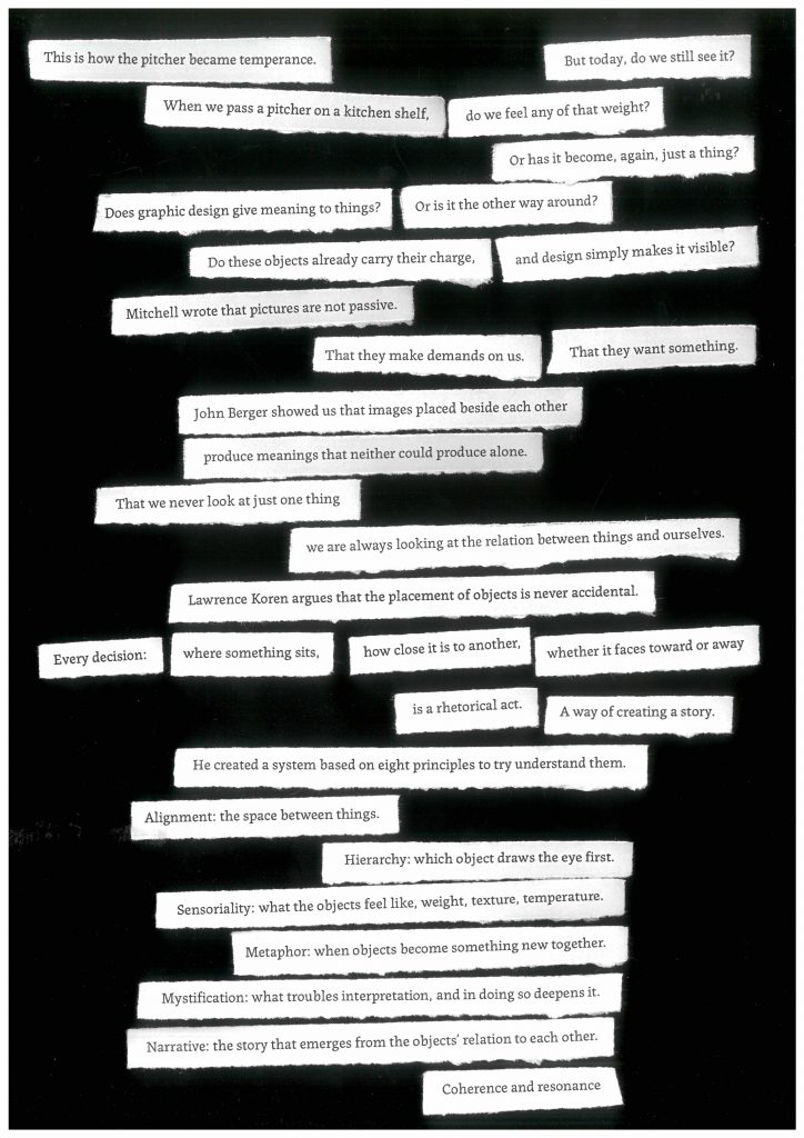
John Berger’s Ways of Seeing begins with a simple but radical idea: the way we see things is always shaped by what we already know, believe, and have experienced. We never look at an object in isolation, we look at it in relation to ourselves, our memories, and the context in which it appears. This idea is central to my project, which explores why certain ordinary objects feel charged with meaning, almost magical. Because seeing is always personal and contextual, my line of inquiry asks: Does graphic design give meaning to things or is it the other way around?
Berger’s book is unusual in that its design does the arguing. Rather than simply describing his ideas in text, he uses the layout of the book itself to demonstrate them. Images appear without captions, or with captions that say something unexpected. Paintings are placed beside advertisements, beside other paintings, beside photographs, and the meaning of each image changes depending on what surrounds it. The reader doesn’t just read about this effect, they experience it directly on every page. Curation and layout are not neutral decisions. Placing one image beside another is an act of meaning-making. Context is as significant as the things themselves.
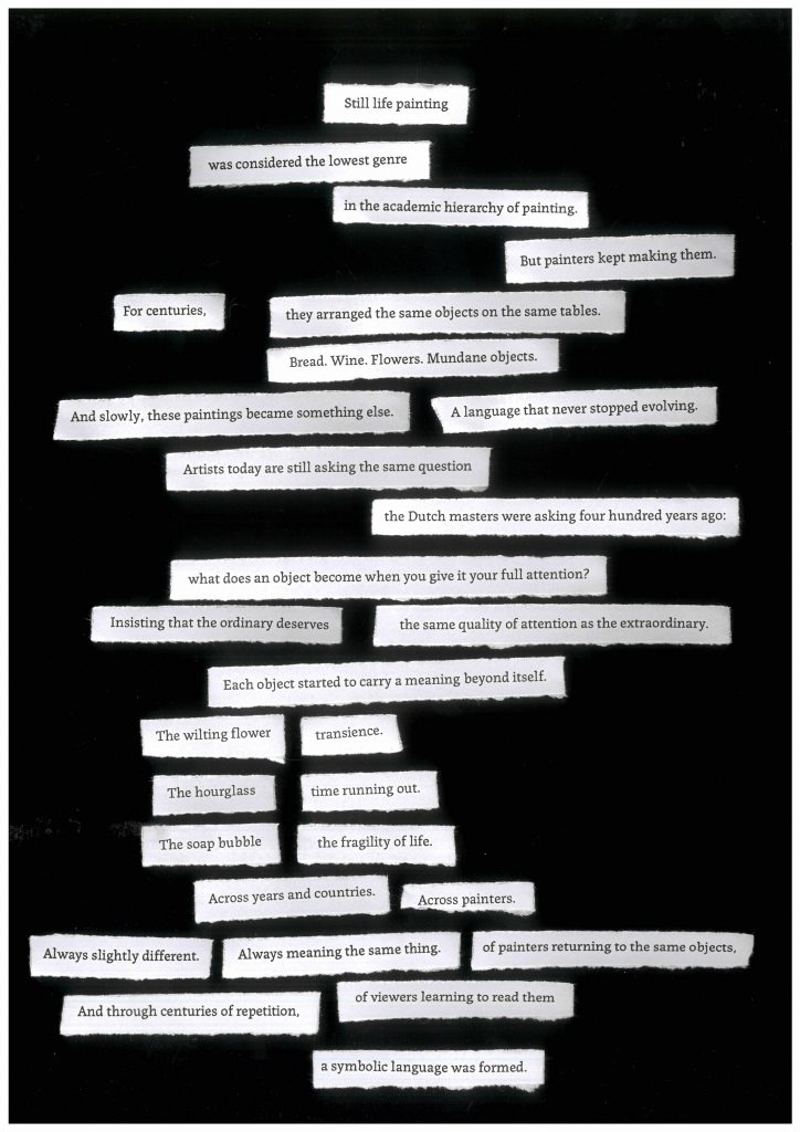
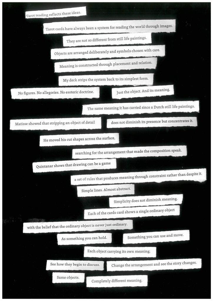
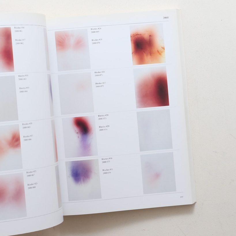
This directly influenced my early experiments in the project. Inspired by Berger’s Essay 2, which abandons text entirely and communicates entirely through compositions of images, I began curating still life paintings around single recurring objects. I gathered paintings containing pitchers, or skulls, or lemons, and placed them side by side to study how the same object changes meaning depending on its context: what surrounds it, what period it comes from, what other objects it is arranged with. This process of comparative curation became a method for understanding the symbolic language of still life, learning, for example, that the pitcher became to show temperance across centuries of painting, or that the lemon almost always carries an idea of deception or bitterness beneath a beautiful surface.
Berger also traces the origins of the visual arts back to magic and ritual. He argues that art was originally an experience set apart from everyday life, made in a specific place, for a specific sacred or magical purpose, and that this sense of the image as something powerful and charged has never entirely disappeared, even in its most commercial forms. This is directly relevant to my project’s central interest in how object become talisman: the object that has been elevated from the ordinary into the symbolic through sustained attention and ritual use. My tarot deck attempts to do this, by taking mundane objects and restore to them the kind of attention and significance that Berger describes as the original function of the image.
Berger’s argument also connects naturally to Koren’s Arranging Things, which I use as my main studio reference. Where Berger explains that meaning is always produced by the relation between an image and its context, Koren provides the precise vocabulary for how that relation is constructed, through the spatial decisions of hierarchy, alignment, and proximity. Together they form the theoretical foundation of my tarot deck, where the meaning of a reading is never in a single card but always in the relationship between the three cards drawn, and in how the reader chooses to place them.
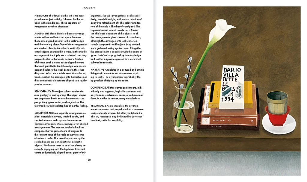
Koren’s Arranging Things is built around the idea that the placement of objects is never accidental or neutral. Every decision about where something sits, how close it is to another object, its size or colour are all meaningful. Koren calls this a rhetoric of arrangement applying it to a set of visuals painted by Nathalie du Pasquier. The chosen objects and the way they are arranged determine what a composition communicates. This idea sits at the heart of my project, which explores how ordinary objects accumulate symbolic meaning and how graphic design can make that meaning visible.
The book is structured in two parts. The first is a short theoretical introduction outlining eight principles for reading and constructing arrangements: hierarchy, alignment, sensoriality, metaphor, mystification, narrative, coherence, and resonance. The second is a long sequence of annotated still life photographs, each one analysed through those principles. What is interesting about this structure is that the book itself demonstrates its own argument, it is an arranged object.
The eight principles can be understood in three groups. The first three, hierarchy, alignment, and sensoriality, describe the immediate physical experience of looking at an arrangement from placement to colour, size or temperature. It is a basic first analysis of what people see without trying to understand. The next three, metaphor, mystification, and narrative, analyses what happens when the objects are placed into a context, next to each other and with a past. The element that resists easy interpretation is what Koren calls mystification, and he argues that this resistance is not a failure but a deepening of meaning. Narrative is the story that emerges from this arrangement. The final two principles, coherence and resonance describe the experience of the reading as a whole. This framework transformed my practice. Before reading this reference, I was working intuitively cutting objects out of still life paintings, isolating them, curating them in groups. Koren gave me a language investigate my inquiry.
Koren’s eight principles became the structural logic of my tarot deck. Each card presents a single object without any background. But when cards are drawn together, Koren’s system translated to game rules help read the image created. The reader must consider which card dominates, how to place them in relation to each other. They must notice what each object feels like before they read its name. They must read the cards as an image composed by their unconscious. The reading instructions I have written for the deck map directly onto Koren’s eight principles, turning a theoretical framework into a lived ritual.
Koren also raises a question that is important for my project: who decides what an arrangement means? He describes his rhetoric as provisional and not a definitive system. This matters because it acknowledges that meaning is not fixed by the designer but produced in the encounter between the arrangement and the person reading it. A tarot reading works exactly this way. I designed the system: the objects, the names, the rules, but the meaning of any particular reading belongs entirely to the person drawing the cards. Koren’s framework legitimises this openness.
Bouchez describes the intention of her book as an endless quest for beauty and joy in the mundane.Tracing the history of design from craft traditions to contemporary consumerism, she argues that objects have increasingly become vehicles for manufactured desire, their emotional and symbolic meanings artificially created through marketing rather than accumulated through use and attention. What is most interesting for my practice is her claim that objects are not passive, that they carry traces of relationships, time, and attention, and that this accumulated charge gives them something close to a presence or an inner light.This supports my approach to the objects in my tarot deck: I am not proposing a meaning while trying to reveal a charge that is already there, embedded in the object’s history, its symbolic tradition, and the personal memories it activates in the reader. Bouchez legitimises an intuitive and sensitive way of working. In my practice, I did different experiments to try understand and extract this essence of objects.
Sontag’s central argument that to photograph something is to appropriate it, to establish a relationship with it, is directly relevant to my interest in how images transform ordinary objects. My project began with photography precisely because of this quality: the camera isolates an object from its surroundings, frames it, and in doing so changes its context and status. What was overlooked becomes significant and what was ordinary becomes meaningful. Sontag also describes photographs as memento mori, every image of a thing is also a record of its transience, its mortality. This connects my photographic experiments directly to the vanitas tradition in still life painting, where objects are arranged not to celebrate life but to remind the viewer of its brevity. Most important to my project is her observation that photographs function as talismans. This is exactly what my tarot cards attempt: to use the image of an ordinary object as a means of accessing a meaning that exceeds the object. My card game becomes an object itself and the card echoes talismans.
Mitchell’s essay is more provocative. She states that images are not passive objects waiting to be interpreted but active presences that make demands on the viewer. He treats pictures as if they possess a kind of life, but as a way of shifting attention from what images represent to what they do, how they behave, and how they affect the people who encounter them. This reframing is directly relevant to my project, which is concerned with the moment an ordinary object stops being just a thing and starts feeling charged, animated, almost magical. Mitchell’s argument extends and complicates Bouchez’s idea that objects carry an inner life. Where Bouchez focuses on the physical object, Mitchell applies the same logic to images of objects, suggesting that the photograph or drawing of a thing can be as active and demanding as the thing itself. Regarding my tarot cards, the image on each card is not simply a representation of an object but a presence, capable of producing feeling and meaning independently. This encourages me to think carefully about the object itself and how its image behaves when placed in a reader’s hands.
Steyerl’s concept of the poor image introduces a critical perspective on how images circulate within contemporary capitalist systems. Rather than valuing high-resolution, polished images associated with advertising and consumer culture, she focuses on degraded, compressed, widely shared images that operate outside traditional hierarchies of value. This is important for my practice because it challenges the aesthetic norms that often neutralise or standardise objects through clean, desirable imagery. In relation to my interest in the magic of ordinary objects, this suggests that magic might emerge not through perfection but through distortion, loss, or circulation. This connects to the history of still life painting itself. Still life was long considered the lowest genre in the academic hierarchy of painting. Yet it is precisely from this lowly, overlooked genre that the richest symbolic language of objects emerged. Steyerl’s in defense of the poor image is, in this sense, a contemporary version of the same argument, that symbolic power does not depend on prestige or polish, and that the overlooked image often carries more presence than the celebrated one.
Yanagi’s collection of essays argues that the most meaningful objects are not the rare or the precious but the plain and ordinary, the everyday things made by hand, used daily, and rarely noticed. He writes about the Japanese mingei craft tradition, as he mourns a shift in industrial society where mass production has severed the relationship between the maker, the object, and the person who uses it. Workers no longer find meaning in what they make, and as a result objects lose the vitality they once carried. Yanagi’s question “they may simply be things, but who can say they don’t have a heart?” is a question I also asked myself and tried to respond to with my tarot deck. Each card takes a single ordinary object, and restores to it the kind of attention Yanagi describes. By naming the object and isolating it, the card makes the reader to look again at those mundane objects
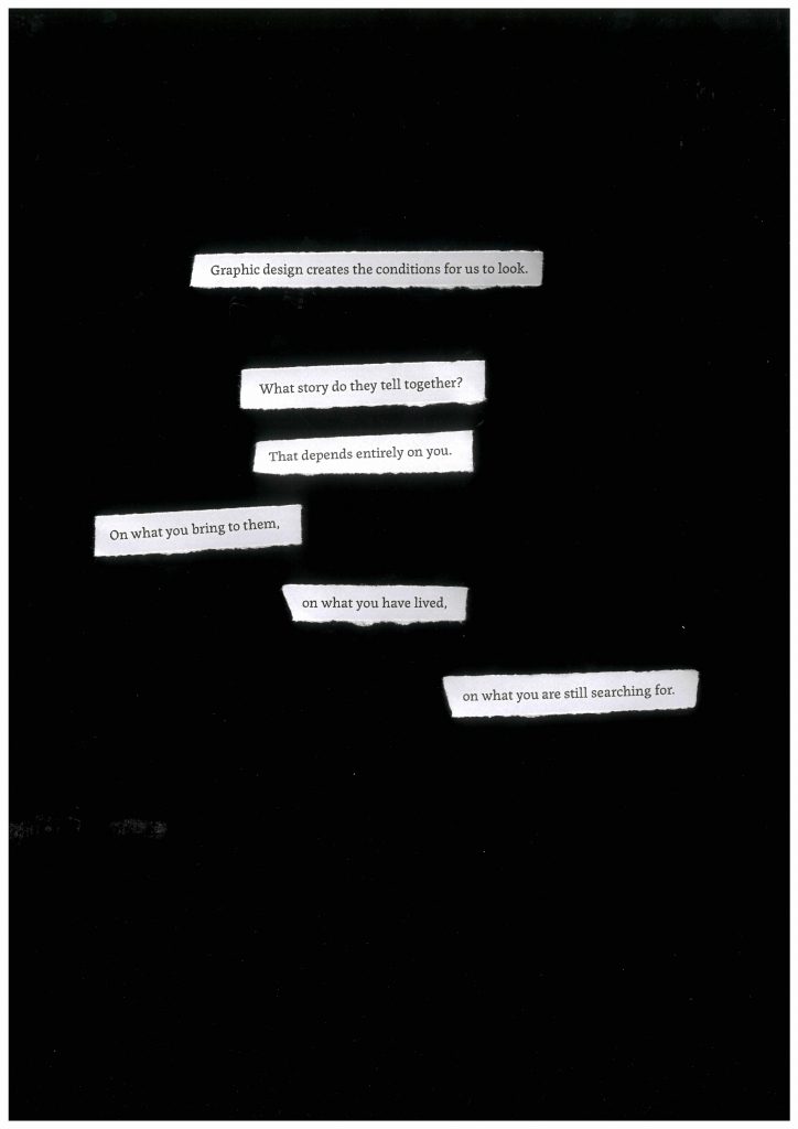
Sontag’s essay argues against the separation of form and content in art. She insists style is not a decorative layer applied over meaning but is meaning. The way something is made, the decisions about colour, shape, material, and composition, are inseparable from what it communicates. This is directly relevant to my tarot deck, where every formal decision carries symbolic weight. The choice to render an object in watercolour rather than photograph it, to use a single word rather than a sentence, to leave the background empty rather than fill it, none of these are aesthetic preferences, they are the concept. Her observation that a work of art is an experience rather than a statement also shapes how I think about the reading ritual. The tarot cards do not deliver a fixed meaning to a passive reader, they create the conditions for an experience that requires, as Sontag puts it, the complicity of the experiencing subject. The reader is not receiving the meaning, they are producing it.
Tillmans’ book operates on the simple principle that nothing is more worthy of attention than anything else. In the exhibition, portraits, architecture, abstract light experiments, domestic objects are all printed at varying scales and pinned directly to the wall without frames, without hierarchy. In the book, all the photographs are brought back at one same size, like a catalogue but without giving more information about the context. Tillmans demonstrates that this levelling of attention is a deliberate act of seeing. His layout choices reinforce this argument formally. He also shows that arrangement is never neutral. This connects directly to Koren’s rhetoric of arrangement and to my own interest in how graphic design can give meaning to overlooked objects.
Quintanar’s practice explores drawing as a system of rules and protocols. He transforms his artworks into games to be played with rudimentary marks, simplified forms, striking colour, and an almost childlike naiveness. He reduces recognisable objects to near-abstract outlines and numerical notations. For my project, this is both a formal and conceptual reference. It demonstrates that abstraction does not diminish an object’s symbolic charge but can intensify it by removing everything that distracts from its essential form. His approach encouraged me to explore how far I could simplify the objects in my tarot deck while retaining their legibility and symbolic weight. There is also something important in his framing of drawing as play, as a process governed by rules but also instinct. This connects to my interest in the tarot deck as a system, a set of objects organised by a logic that produces meaning through placement.
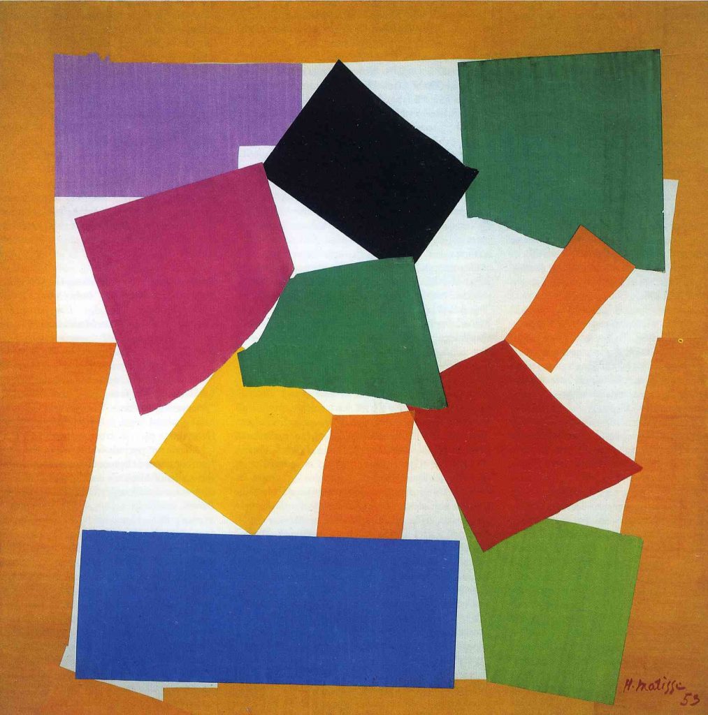
Matisse developed his ‘gouaches découpées’, late in his life because he was unable to paint due to illness.It is a technique of cutting painted paper into forms and arranging them into compositions. In works like L’Escargot, he reduced a recognisable object to colour and geometric shapes, eliminating all descriptive detail until only the essential form remained. The cut itself became the drawing, form and colour mixing together. This is directly relevant to my tarot deck, where each object must be immediately legible and visually striking, but simple enough to be read differently by different people. Matisse demonstrates that stripping an image of detail doesn’t diminish its symbolic charge but concentrates it. Matisse arranges his cut forms into compositions that produce different narratives depending on placement and proximity, which is the logic of my tarot reading system, where cards arranged together tell a different story every time.

Paul Rousteau’s photographic practice transforms ordinary objects and everyday scenes into something ethereal and almost immaterial. Through blur, overexposure, intense colour, and deliberate loss of legibility, he dissolves objects into atmosphere rather than describing them. This is directly relevant to my interest in the magic of ordinary objects, because Rousteau demonstrates that the symbolic charge of a thing does not depend on its clarity. What is particularly significant for my project is how Enfances places abstracted images and pictures of the mundane on exactly the same level. Nothing is elevated above anything else. This democratisation of attention connects to Tillmans’ approach, and reinforces my own decision to treat ordinary objects as worthy of the same visual seriousness as any symbolic or sacred image. His work reminds me that photography can produce aura rather than simply record it, and that imperfection, blur, and loss of detail can intensify an object’s presence rather than diminish it.
Ingold’s central argument is that making is not the imposition of a pre-conceived idea onto passive material, but a conversation between the maker and the material, a process of following, attending, and responding rather than controlling. He refuses the disciplinary boundaries that separate anthropology from art, archaeology from architecture, arguing that all making is fundamentally the same activity: a form of sustained attention to the world and to the things within it. This is relevant to my project, as it legitimises an intuitive, process-driven way of working. My tarot deck is not designed from a fixed concept but emerges through experimentation with objects, images, and materials. Ingold also frames the made object as a cultural and ritual object. There is no separation between the anthropological study of a talisman and the act of making one. My tarot deck is a designed and printed object, but it is also a ritual tool, a system of symbolic meaning rooted in centuries of cultural practice around objects.
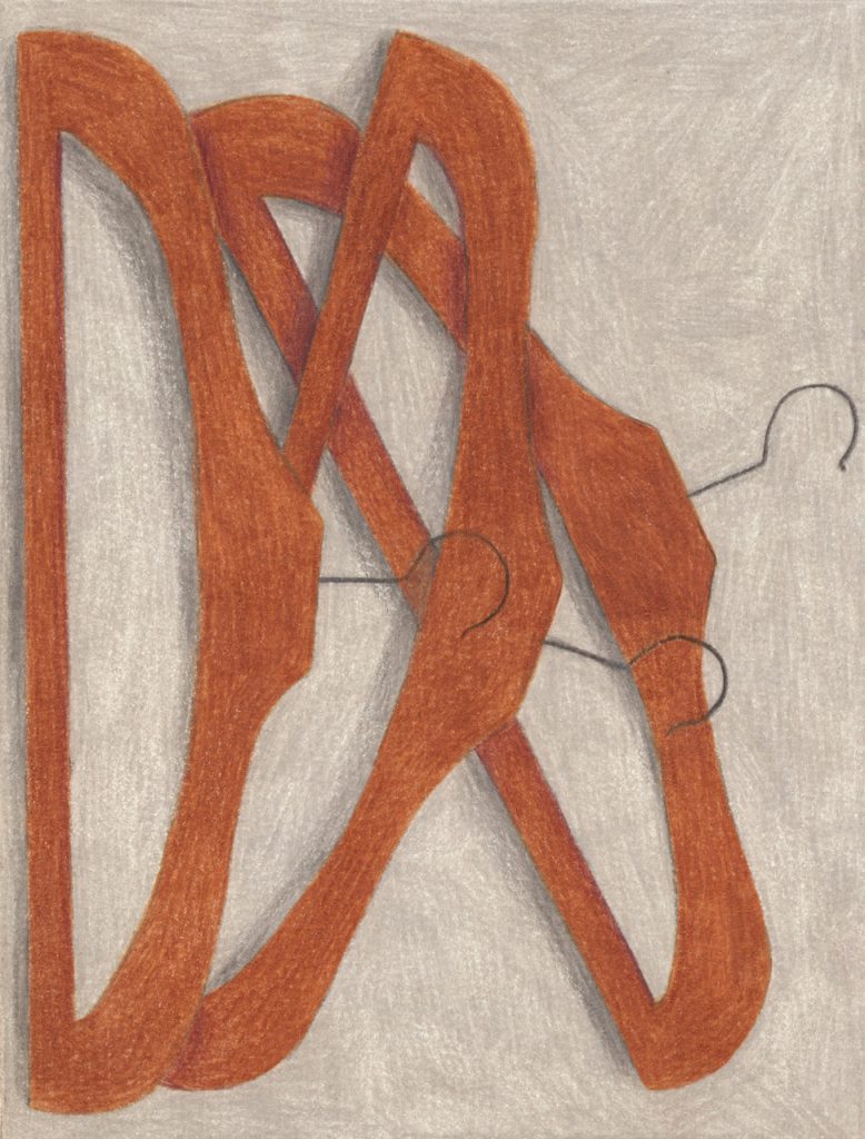
Julie Jonquet-Caunes is a Paris-based illustrator and graphic designer whose practice is built around the ordinary object. In her series Objets Trouvés, she draws everyday objects, pieces of furniture, domestic items, mundane things, in coloured pencil, her style between hyperrealism and trompe-l’œil. The result is a collection of what she calls intimate portraits of the everyday. This is directly relevant to my project because Jonquet-Caunes demonstrates that the act of drawing an ordinary object shifts the attention we give it. This is exactly what my tarot deck attempts: to frame ordinary objects in a way that makes the reader see them differently. Her careful compositions also connect to Koren’s rhetoric of arrangement, the placement, balance, and proximity of objects within each image are as meaningful as the objects themselves. For my own mixed media approach, her work proves that illustration can carry the same symbolic weight as photography.
Annotated bibliography
(a) Mitchell, W. J. T. (2005). “What Do Pictures Want?” In What Do Pictures Want: The Lives and Loves of Images. Chicago: University of Chicago Press, pp. 28–56.
(b)“Pictures are things that have been marked with all the stigmata of personhood and animation: they exhibit both physical and virtual bodies; they speak to us, sometimes literally, sometimes figuratively” (Mitchell, 2005, p. 30)
(c) Mitchell’s suggestion that images can be treated as if they possess “personhood and animation” is directly relevant to my project, which explores the magical or animated quality of ordinary objects. His argument shifts attention from what images represent to what they do, how they behave, and affect viewers. This creates a strong parallel with Bouchez’s idea of objects having a “life of their own” but extends it to images of those objects and in general. In my practice, this raises the possibility that photographs themselves can become active agents, not just representations of objects. The “magic” therefore operates on two levels: the object may appear animated, but the image also participates in this animation. This perspective encourages me to think of photography as a way of producing images that convey this idea.
(a) Steyerl, H. (2012). “In Defense of the Poor Image.” In The Wretched of the Screen. Berlin: Sternberg Press, pp. 31–45.
(b) “The poor image is a copy in motion. Its quality is bad, its resolution substandard.” (Steyerl, 2012, p. 32)
(c) Steyerl’s concept of the “poor image” introduces a critical perspective on how images circulate within contemporary capitalist systems. Rather than valuing high-resolution, polished images associated with advertising and consumer culture, she focuses on degraded, compressed, widely shared images that operate outside traditional hierarchies of value. This is important for my practice because it challenges the aesthetic norms that often neutralise or standardise objects through clean, desirable imagery. If commercial photography tends to present objects as perfect, the “poor image” offers an alternative: an image that is low-quality, unstable, and evolving. In relation to my interest in the magic of ordinary objects, this suggests that magic might emerge not through perfection but through distortion, loss, or circulation. Blurry images often have more aura than clean pictures. It pushes me to consider how image quality, resolution, and distribution affect perception, and whether embracing imperfection can reintroduce ambiguity and presence into photographic representations of everyday things.
(a) Bouchez, Hilde. A Wild Thing. Art Paper Editions, 2021.
(b) “Objects are not passive. They carry traces of relationships, time, and attention.”
(c) In this book, Bouchez develops an idea that defines everyday objects as active participants in lived experience rather than inert materials, almost attributing them a magic aura, a mystical allure or an inner light. She exploring the history of design as well as the latest tendencies to try explain what is the intangible appeal, the extra dimension of those objects. In my practice, helps me understand how objects can carry a ‘presence’ depending on historical and personal context. I am interested in how an object can feel charged through symbolism, but also through accumulated attention and use. In my work, this supports an approach where objects are not staged as neutral still-life elements but treated as if they already contain a narrative and a power. It also legitimises a sensitive, almost intuitive practice, where meaning is not imposed but revealed.
(a) Sontag, Susan. On Photography. Farrar, Straus and Giroux, 1977.
(b) “To photograph is to appropriate the thing photographed.” (Sontag, 1977, p. 4)
(c) Sontag’s idea of photographic “appropriation” is crucial for understanding photography as an active transformation of reality rather than a neutral recording tool. This is particularly relevant to my interest in the “magic” of ordinary objects, because it suggests that photography itself can produce a kind of shift in perception. In my practice, it defines photography as a process that alters the status of everyday objects simply by isolating and reframing them. It extracts and multiplies its original aura. This opens up a methodological approach where meaning is generated through composition and lightning rather than through physical alteration of the object. Photography becomes a way of revealing the qualities already present in the ordinary. It can be used to share the stories those objects, but shouldn’t flatten them.
(a) Vial, S. (2014). Court traité du design. Presses Universitaires de France.
(b) “Le design n’est pas le champ des objets mais le champ des effets.” (Vial, 2014, p. 115)
(c) Vial’s definition of design as the production of experience rather than objects themselves provides a critical framework for reconsidering both objects and images in my practice. It makes me reconsider the material form and think more of the conditions of perception and use. But he introduces the concepts of overproduction and consumption in the fields of design. This is crucial to considering how contemporary design, especially graphic design, functions within capitalist systems. In this context, the “magic” of ordinary objects becomes suppressed by their reduction to consumable images and commodities. My practice positions itself against this logic by using photography to reframe those object that didn’t have any meaning put into. I aim to change their perception and create a space where objects can be experienced outside of their designed purpose.
(a) Rousteau, P. (various works). Photographic practice.

(c) Paul Rousteau’s photographic approach offers a compelling visual practice of transforming ordinary objects into something ethereal and almost immaterial. Through the use of blur, light, overexposure, and intense colour, he destabilises the legibility of the image, dissolving objects into atmosphere and creating an aura. This is particularly relevant to my interest in the “magic” of everyday objects, as it demonstrates how photography can move beyond representation and into senses and emotions. Rather than clearly defining the object, Rousteau’s images that invite viewer to experience rather than identify. In my practice, this inspires a shift away from sharp, descriptive imagery toward something more ambiguous and delicate. He uses photography to show things how he sees them through his eye.
My line of inquiry
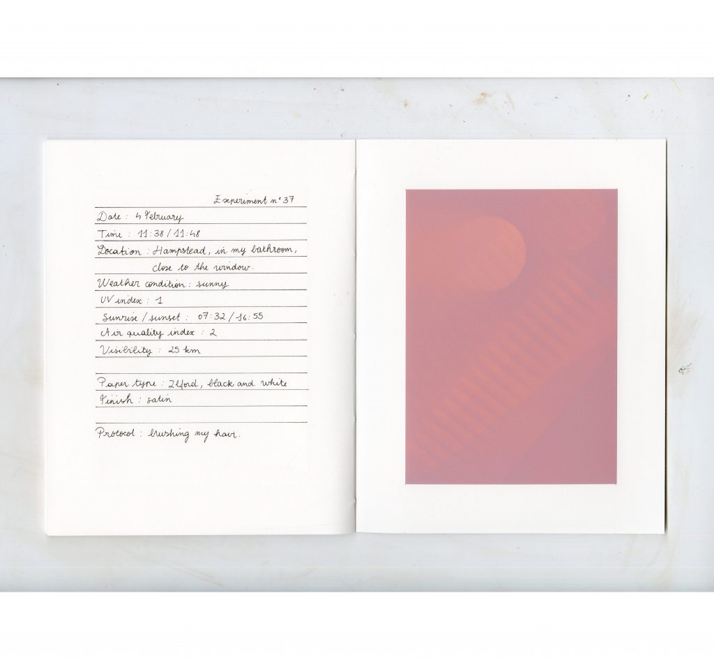
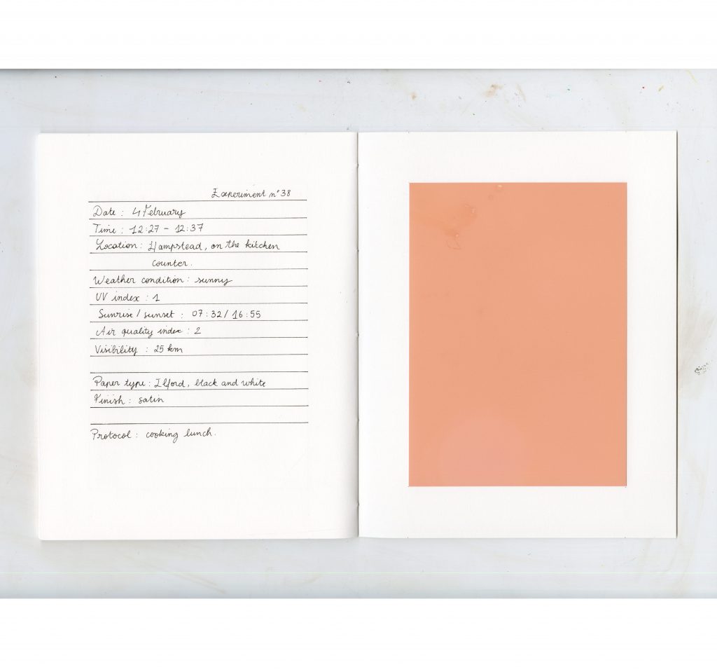
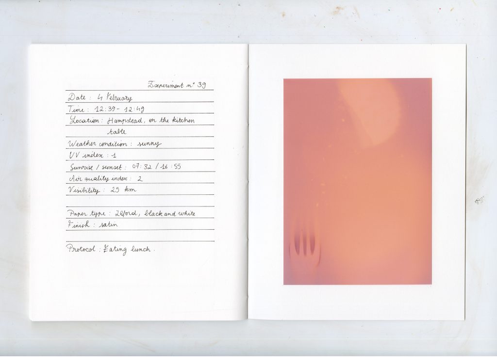
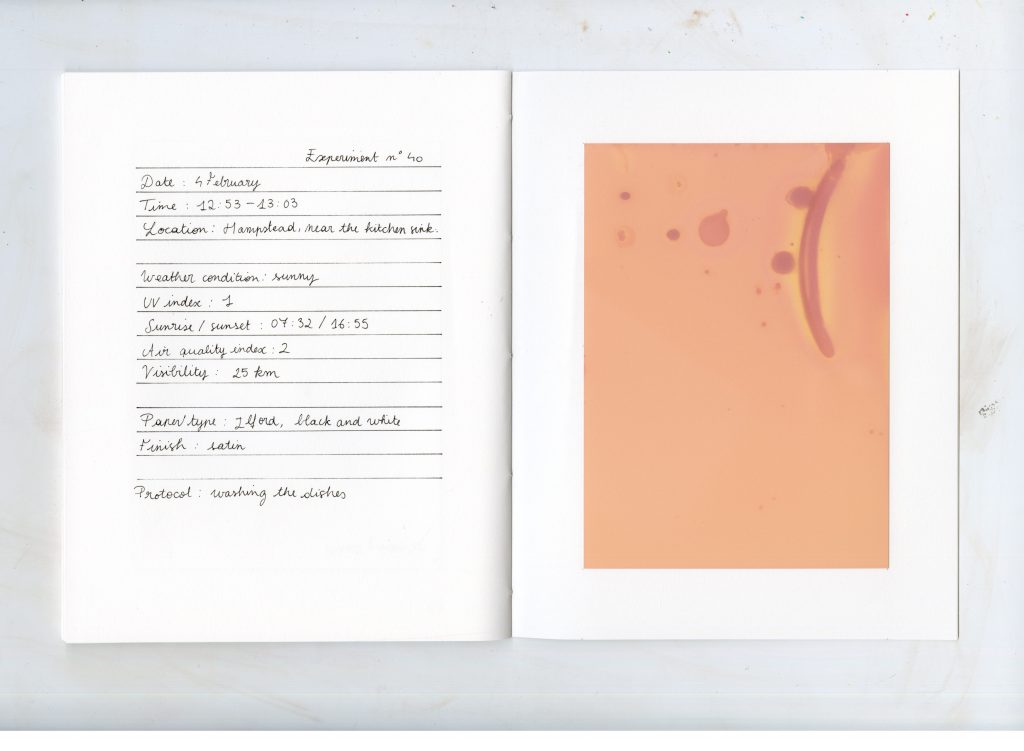
This project investigates how ordinary objects can be perceived as “magical” and how photography can participate to change their perception. My interest goes from religious and witchcraft objects to everyday objects how everyday things can appear charged, active, or with a certain aura when removed from their usual context. The central question is: how does perception shift when an object is isolated, staged, or photographed, and when does it begin to feel like it has presence beyond its material function?
I will explore this through a photography-based practice combining still life composition, found objects, and controlled lighting. By arranging banal objects in deliberate ways and documenting them photographically, I test how meaning and “aura” can be constructed or intensified through visual framing. This approach is informed by ideas of photographic reproduction and aura (Susan Sontag), and the emotional and material sensitivity of objects (Hilde Bouchez). The work ultimately asks whether “magic” is something inherent in objects, or something produced through acts of seeing, arranging, and photographing them.
Group project
Sarah, Doreen, and I began this exploration with very different perspectives and levels of knowledge, shaped by our diverse backgrounds, countries, and education about sustainability. When we started working with data, we encountered countless models and visual systems, each claiming to represent reality. The variety, and sometimes contradiction within these representations made us question their objectivity, so we chose to critically examine how maps constructed and communicated.
Our conversations gradually shifted toward textiles and threads, a shared interest that felt both intuitive and meaningful. Textiles are closely tied to global systems of production, waste, and labor, making them an interesting lens through which to reflect on sustainability. They are also widely used by UAL students across disciplines and for diverse purposes, which made the material context feel relevant to our own environment.
Embroidery, traditionally being a community activity shaped the way we worked as a group. It became a collective practice where we exchanged skills and learned techniques from scratch throughout the process. It also facilitated decisions, tasks distribution and experimentation. Embroidery was the best way to work with waste materials and translate data into a visual language.
References from the reading list
Echoing the example of the imaginary city of Zhiango from the Conditional Design Workbook, built entirely through a defined set of rules, we established our own framework to construct the map. One of our core rules was to work exclusively with waste materials, turning limitation into a generative constraint. We selected specific types of pollution and translated them into visual references, but instead of transferring exact numerical data, we chose to interpret it through personal perception and understanding.
We established a frame with the embroidery hoop and created a key that assigned different stitches, colours, threads, and fabrics to particular forms of pollution and locations. This system guided our process while allowing space for subjectivity. The reused materials themselves carried meaning, reinforcing the theme of sustainability. As the three of us worked simultaneously within these shared rules, the outcome was even more unpredictable and started reflecting the complexity of data representation.
This text compares colonial cartography and Siamese mapping traditions reveals how differently realities can be constructed through maps. The widely used Mercator projection, developed during European expansion, reflects a colonial worldview. In contrast, historical maps from Siam (present-day Thailand) operated within entirely different frameworks and didn’t show any invisible borders formalised by colonising powers. One form, the “cosmograph,” symbolically represented the Three Worlds of Buddhist cosmology, depicting heavens and hells rather than territory. And other maps functioned as guides for military campaigns or coastal navigation, combining multiple perspectives and lacking a fixed, unified geographic scale. They were relational and purpose-driven.
These examples demonstrate that maps do not have to reflect reality to be understood, they can construct it. Recognising that the world map we commonly use is rooted in a colonial logic, we chose to distance ourselves from the Mercatorian view. Instead, we worked with the Dymaxion map, folding and cutting it, layering information to disrupt habitual perceptions and propose alternative understandings.
References outside the reading list :
This book examines our collective addiction to fast fashion and the contradiction between awareness and action. Even when we know the environmental and social damage behind clothing production, consumption remains normalised, convenient, and emotionally driven.
But the thing is, we never really know what happens and to what extent. The book explains the lack of information and questions responsibility in sustainability, particularly the role of major fashion brands. Labels that proudly state “Made in Italy” often refer only to the final stage of assembly, while the materials may have traveled across multiple countries before reaching that point. The earlier stages from raw material extraction to sewing— are frequently outsourced to places where labor is cheaper and regulations weaker. By shifting production to wherever costs are lowest, companies avoid long-term accountability for workers’ wellbeing and environmental impact, while still marketing an image of quality and sustainability.
This is why we chose to represent all this data that is not explained on the labels. We highlighted the hidden complexity of the textile life cycle, exposing how global supply chains obscure responsibility and distance individual consumers from the true cost of what they wear.
A chapter of this book explores how world maps are never neutral representations of reality. Modern cartography developed alongside colonial expansion, when European powers mapped territories in order to control, divide, and claim them. Choices of projection, colour, scale, and even font size can subtly reinforce hierarchies, highlight certain regions, and marginalise others. A map may appear objective, but it always reflects particular intentions and ideas to the point of having an impact on world politics.
Because it is impossible to accurately project a spherical globe onto a flat surface without distortion, every world map involves compromise. The Dymaxion map, developed by Buckminster Fuller, attempts to minimise these distortions by unfolding the globe, challenging conventional dominant countries and putting into perspective the distance between them. So we started using this map, but continued deconstructing it, transforming it into something abstract, that doesn’t correspond to geography standards anymore.
The chapter also highlights ingenious mapping traditions from Indigenous communities, such as navigational charts based on ocean swell patterns, which questions Western standards of accuracy. Ultimately, maps and graphics shape understanding: altering scale, movement, or physical form can dramatically transform how data is perceived and interpreted.
Design practices :
This book demonstrates that almost anything can convey information when framed within a clear context. Using only lines and brief texts, Deutinger creates complex visualisations that communicate diverse forms of data. His minimalist, black-and-white graphics represent topics ranging from the size of countries to the distribution of crops across the planet. Rather than relying on numerical labels, many of the graphs operate through comparison and proportion, encouraging an intuitive understanding of scale.
The book proposes a new logic of reading, distinct from conventional cartography. Instead of prioritising geographic accuracy, he prioritises narrative logic. He completely changed the standards of graphics we are used to and took the approach of simplifying information as much as possible into different images. On the other hand, we chose to show the complexity of the world by selecting one single article from the shop to show full extent of its lifecycle, even if it means not representing the figures mathematically. We layered all the data we could find around to show the whole scale of its impact.
This project is an interactive installation in which the artist employs simple elements like thread, colour, and sewing as starting points to explore relationships between people, objects and their environment. Visitors were invited to bring damaged textile items to be mended during the exhibition, transforming repair into a performance and placing textile in the center. By encouraging participants to care for the garments they valued, the project directly addressed waste and responsibility within textile culture.
The threads used for each repair were left uncut until the exhibition ended. Over time, they accumulated into a layered web stretching across the space. This entanglement visually mapped the complexity of connections between people and their clothes.
In our own work, we also used thread as a connecting device, but to trace global shipping journeys between countries. By linking locations with stitched lines and reusing textile waste collected from bins across the school, we highlighted the environmental impact of production and disposal, exposing the layered consequences of textile consumption.
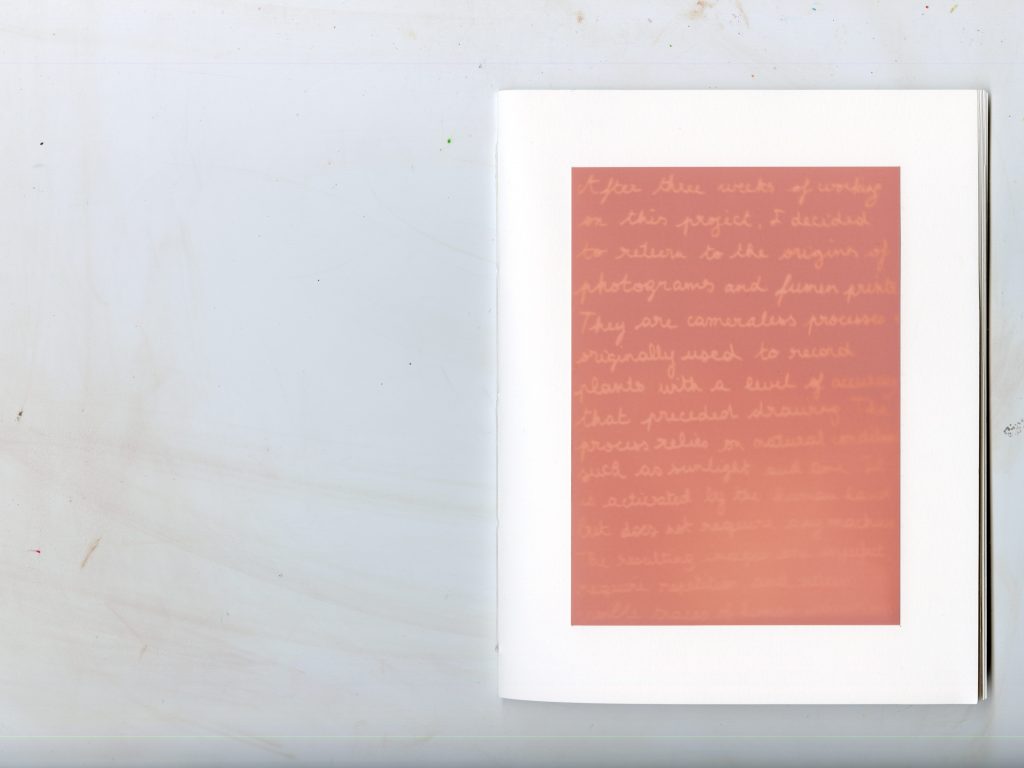
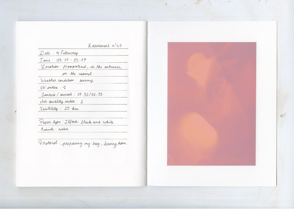
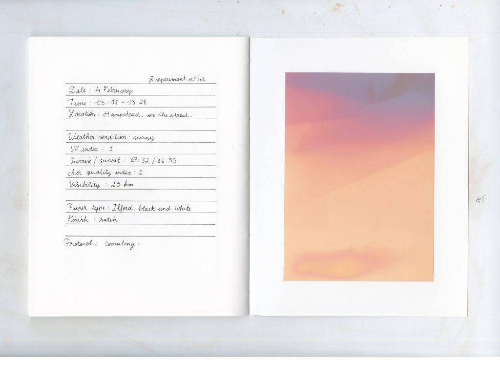
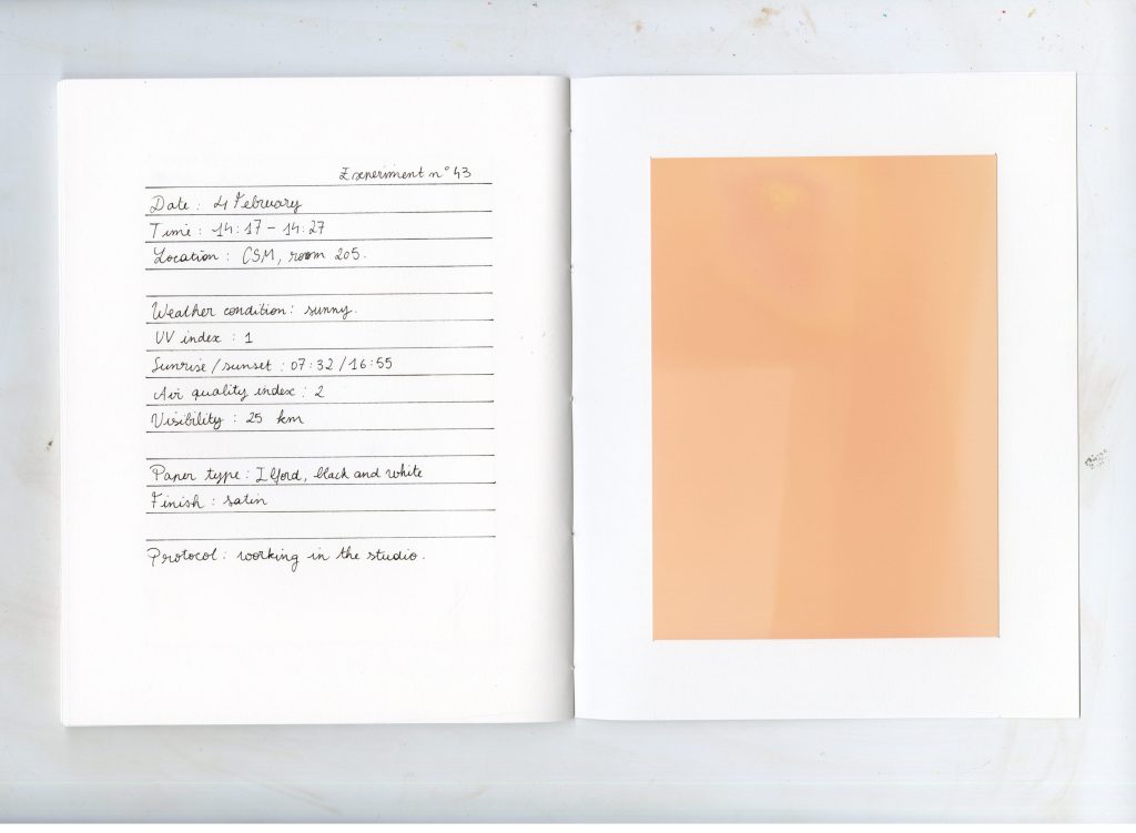
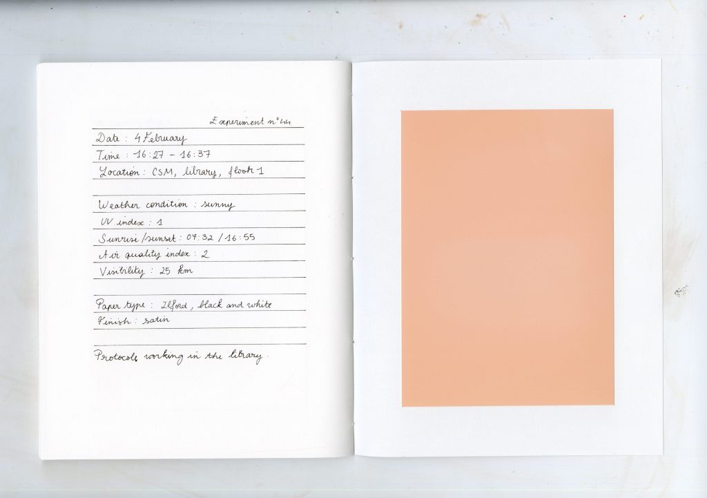
I printed this picture while writing on a transparent paper with a black opaque marker. The sun imprinted the paper while writing so the top part is more contrasted because more exposed and tho bottom part more blurry because more recent. My Text was a performance .
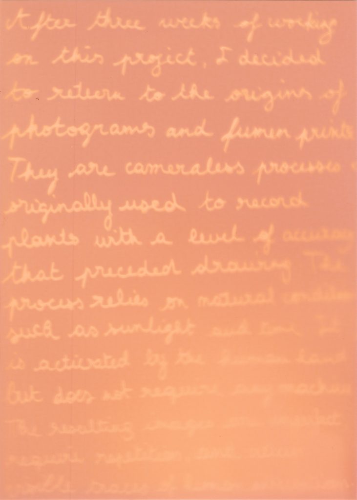
I made this publication completely analog as a part of the performance : the pictures are not fixed and will continue fading when looking at them.

A poor image is the ghost of an image. It is an image that followed a process at the expense of its own meaning, changing its focus. From being uploaded to downloaded and shared, images undergo systematic modifications where the outcome is uncertain and uncontrolled (Steyerl, 2012, pp. 31–45).
I chose to explain Hito Steyerl’s In Defence of the Poor Image according to the Conditional Design Manifesto from the Conditional design workbook . This manifesto explains the concept of conditional design where the approach is more valued than the chosen media, where graphic design becomes a tool or an instrument. Because conditional design is about designing design, workshops are described as games, with a set of conditions and rules.
I translated Hito Steyerl’s text into a workshop game to demonstrate the transformative and collective method of creation of poor images.
Workshop
IN DEFENSE OF THE POOR IMAGE
X Play with multiple participants. X The game takes place in a world that idolizes high-quality images
1, • Preparation
1.1, Choose an original, fixed image.
2, • Circulation
2.1, Make it circulate outside official economies — on file-sharing platforms, torrents, or social media.
2.2, Make it mutate : copies, downloads, and reshares add layers of translation and context.
2.3, Challenge aesthetic and economic hierarchies : poor images are democratic in access but highlight global inequalities.
2.4, Encourage collective circulation rather than fixed ownership, like artworks confined to museums.
3, • Transformation
3.1, Each copy may alter contrast, color, or size.
3.2, Every degradation or glitch adds history, authorship, and survival value.
3.3, Resist the art world’s obsession with perfection, and exclusivity.
4, • Hierarchies of Resolution
4.1, Prevent high-resolution images from dominating the space.
4.2, Prioritize communication and movement over perfection.
4.3, Bring marginalized or radical visual cultures to light, instead of relegating them to the digital margins.
4.4, Defend access, democracy, and the right to visual culture against corporate and institutional control.
5, • Politics of the Poor Image
5.1, Mirror the precarious conditions of cultural workers and the commodification of media.
5.2, Make the images migrate: cross borders, languages, and formats freely, like displaced or fragmented communities.
5.3, Make it visual form of resistance — preserving political cinema, marginalized histories, and ideas excluded from mainstream distribution.
6, • Endgame
6.1, The game ends when the original is untraceable.
6.2, The poor image survives through circulation and movement.
Outcome :
The poor image is a low-resolution, often pirated or compressed copy of an original work. Its “poverty” does not diminish its cultural or political power; rather, it embodies access, circulation, mutation, and collective authorship. Poor images become living archives, resisting control while connecting communities and histories across space and time.
References :
– Maurer, L. (2013) Conditional Design Workbook. Amsterdam: Valiz, pp. ii–xiv.
– Steyerl, H. (2012) In Defence of the Poor Image. In: The Wretched of the Screen. Berlin: Sternberg Press, pp. 31–45.
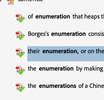
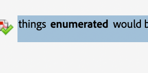
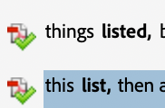
Michel Foucault’s Preface to The Order of Things : An Archaeology of the Human Sciences can be read as a catalogue in itself — a text that inventories systems of thought, names, and classifications (Foucault, 1989, pp. xvi–xxvi). Often described as a manifesto of structuralism, it stands against a certain form of humanism by dismantling the idea of a stable human subject and instead proposing the concept of the épistemè, the underlying structure that shapes what a culture considers knowledge at a given time (Foucault, 1989, pp. xvi–xxvi).
In this sense, the Preface functions both as an introduction and as an inventory itself : Foucault lists his predecessors, maps intellectual lineages, and enumerates the methodological orders that have governed Western knowledge. His text mimics the very mechanisms he analyses. It is rhythmically built from sequences of repetition and accumulation :
394 commas
44 semicolons
41 identifiable lists
5 repetitions
punctuate the pages.
Terms such as
56 order
8 classification
6 enumeration
6 system
2 list
recur like motifs, forming a linguistic taxonomy that mirrors his argument, as if self-referencing the structure of the text.
The repetition of
9 Borges
4 Chinese encyclopedia
13 other names Roussel, Keynes, Cantillon, Tournefort, Linnaeus, Buffon, Cuvier, Darwin, Bauzée, Law, Véron de Fortbonnais, Turgot
underscores the significance of his peers in his demonstration. The ‘Chinese encyclopedia’ whose absurd categories destabilise the reader’s sense of logic. This anecdote becomes Foucault’s demonstration of how every system of order is culturally specific, and how each period invents its own grid of intelligibility.
By analysing the Preface through an inventory, its writing mechanics are revealed as inseparable from its philosophical argument. Each list, each comma, each repetition is not decorative but conceptual. They build a textual space that mirrors Foucault’s archaeology. The Preface is therefore a structural performance, a ‘list of lists’ where the medium embodies the message. Through the enumeration of names, systems, and methods, Foucault shows that to catalogue is already a constructed worldview.
Reference :
In Lines: A Brief History, Tim Ingold explores the fundamental relationship between drawing and writing. He states that ‘The engraver was an artisan, not an artist ; his lines were not expressive but reproductive.’ (Ingold, 2007, p. 135) and discusses how artisans who engraved letters and inscriptions were historically considered craftsmen rather than artists.
This idea directly resonates with my project, where I focus on tombstones. The theme I wanted to bring up in my project is how engraved texts carry meaning. When I observed the engraved names and dates on tombstones, I was struck by how these inscriptions, that hold immense emotional and symbolic weight end up disappearing. They are not written for the dead but for the living. Inspired by this, I decided to highlight and reinterpret these marks.
I began to draw the letters rather than simply write them, allowing them to dissolve and merge into my drawings of plants. In doing so, I blurred the boundary between text and image. While the technique of engraving immobilises the letters, I chose, buy drawing them, to make them lively again. Rosemary Sassoon’s assertion that ‘the form and line of a letter is as sensitive and expressive as the line quality in a drawing’ (Sassoon, cited in Ingold, 2007, p. 179) further reinforces my approach. In my work, writing becomes drawing.
As the stone, a symbol of permanence, begins to crumble and fade, I replaced it with the motif of plants that grow and continue to live. This shift from mineral to organic matter represents the transformation of memory, from something fixed and engraved to something living and evolving. The letters, once static, become part of a living landscape.
In The Gleaners and I, Agnès Varda investigates in her own way the different aspects of gleaning, from an ancient practice to what it has become today. She brings up a memory from her childhood, she had already seen gleaners in the fields near the house where she lived, and that this image had made a lasting impression on her. She considers herself a gleaner of images and her approach on the subject is personal as she goes around with her camera.
My approach on this project is similar as I went to a churchyard because of my initial interest around death, with my camera and discovered a whole other aspect of the place. Between the stones and the trees, I saw people. I ended up reading information about unknown families and people based on their names and chose to pay tribute to them through my photographs.
References :
– Ingold, T. (2007) Lines : A Brief History. London : Routledge, pp. 120–151.
– Varda, A. (2000) The Gleaners and I [film]. Paris : Ciné Tamaris.